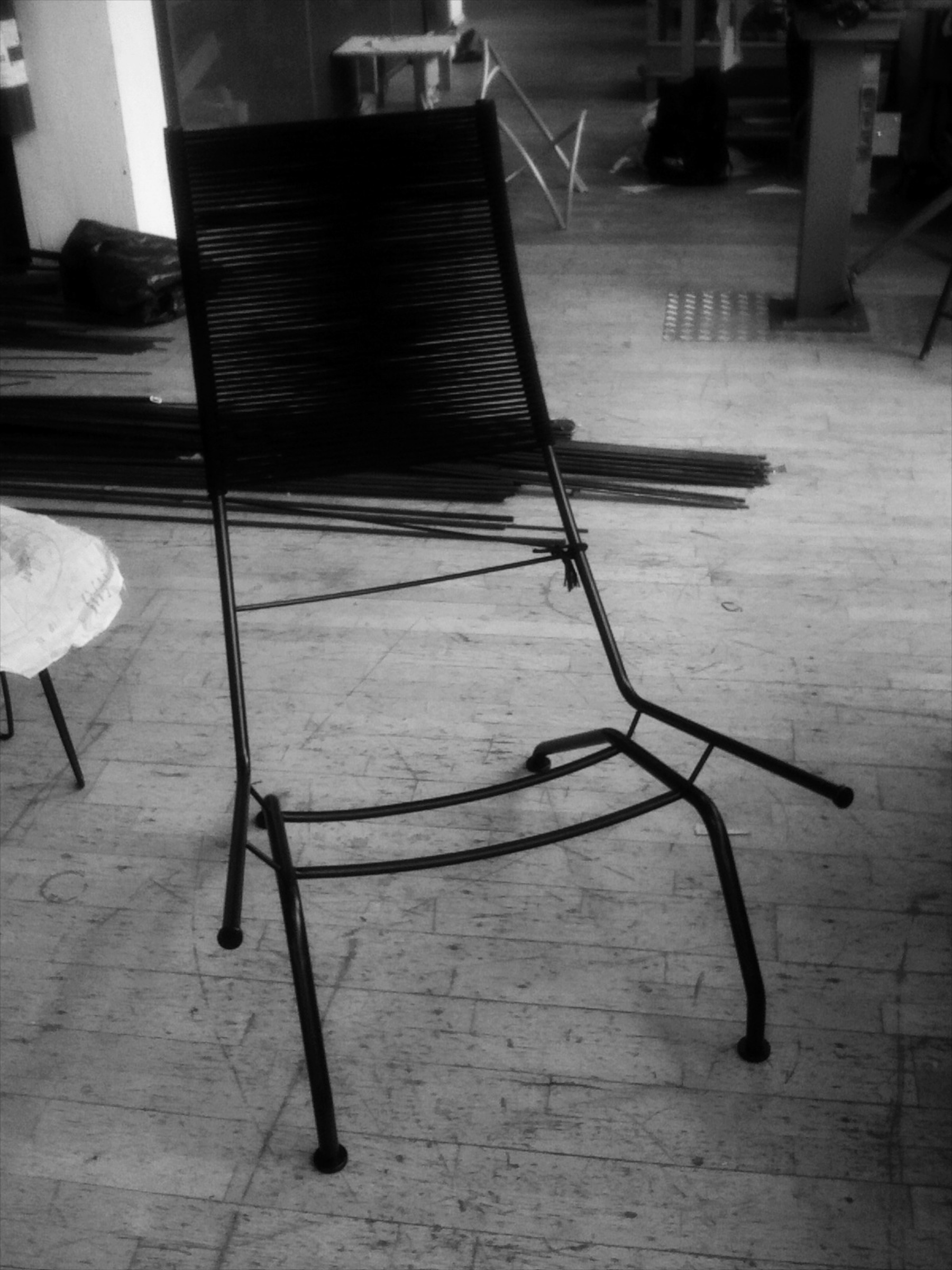
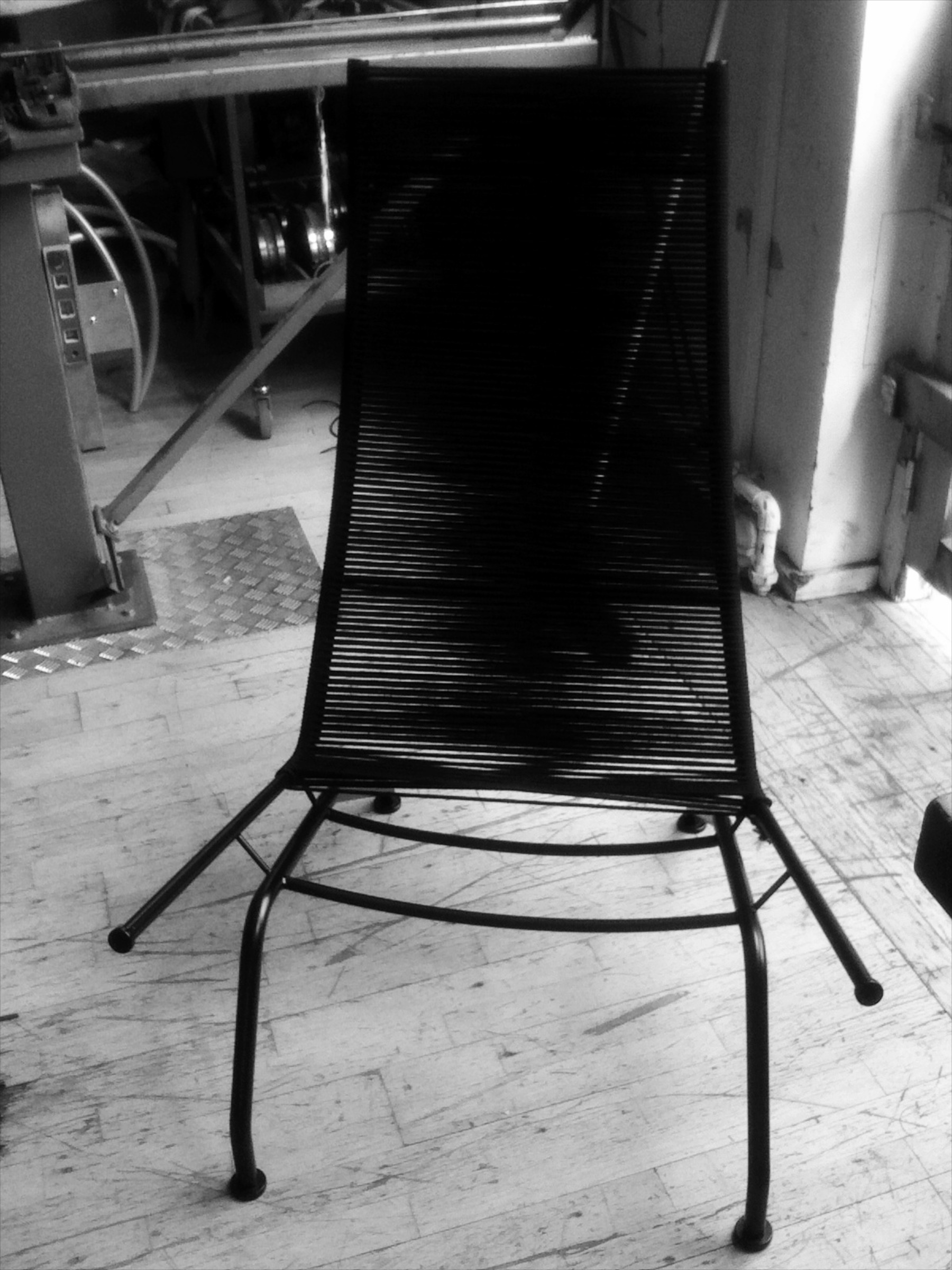
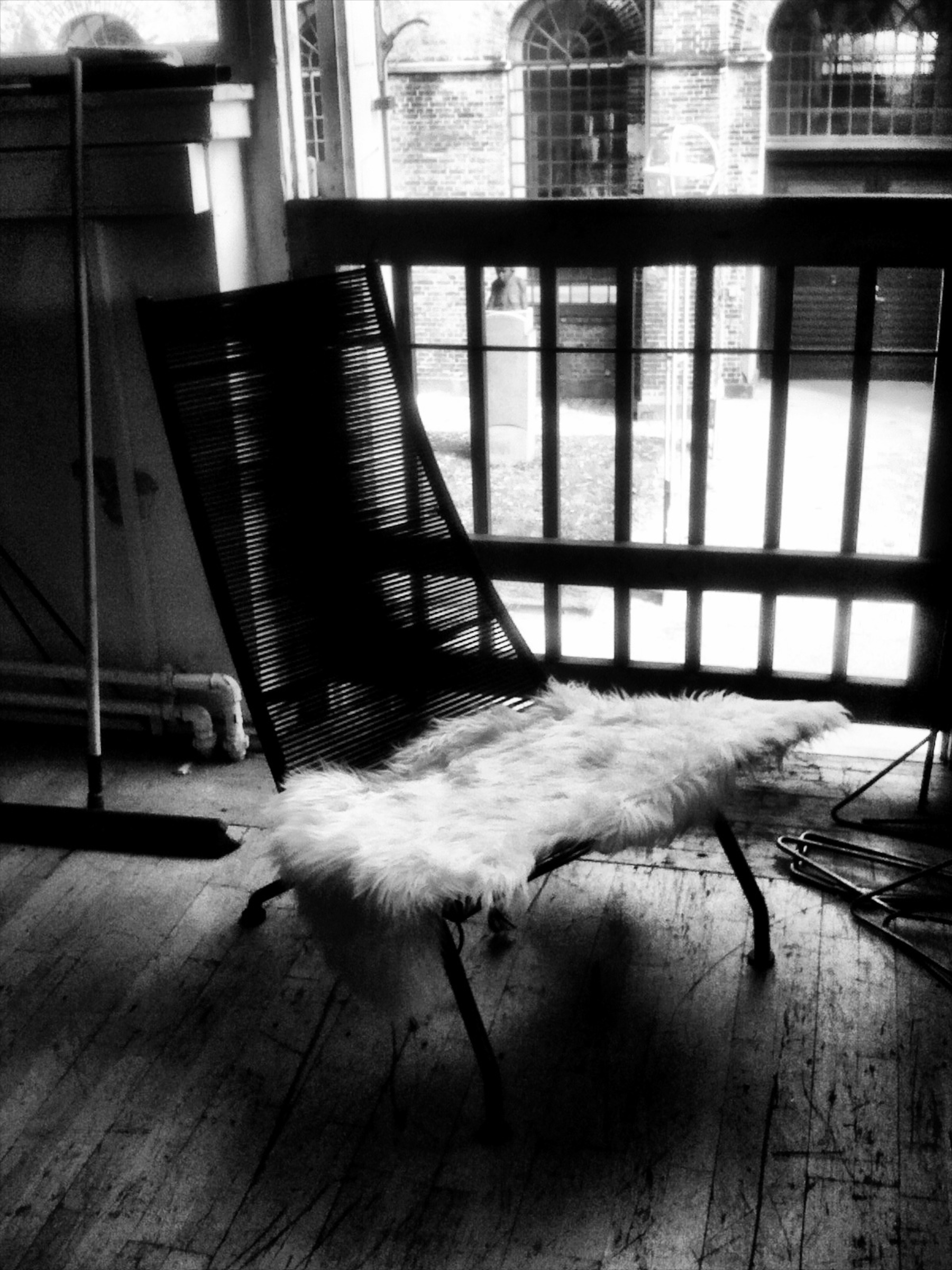
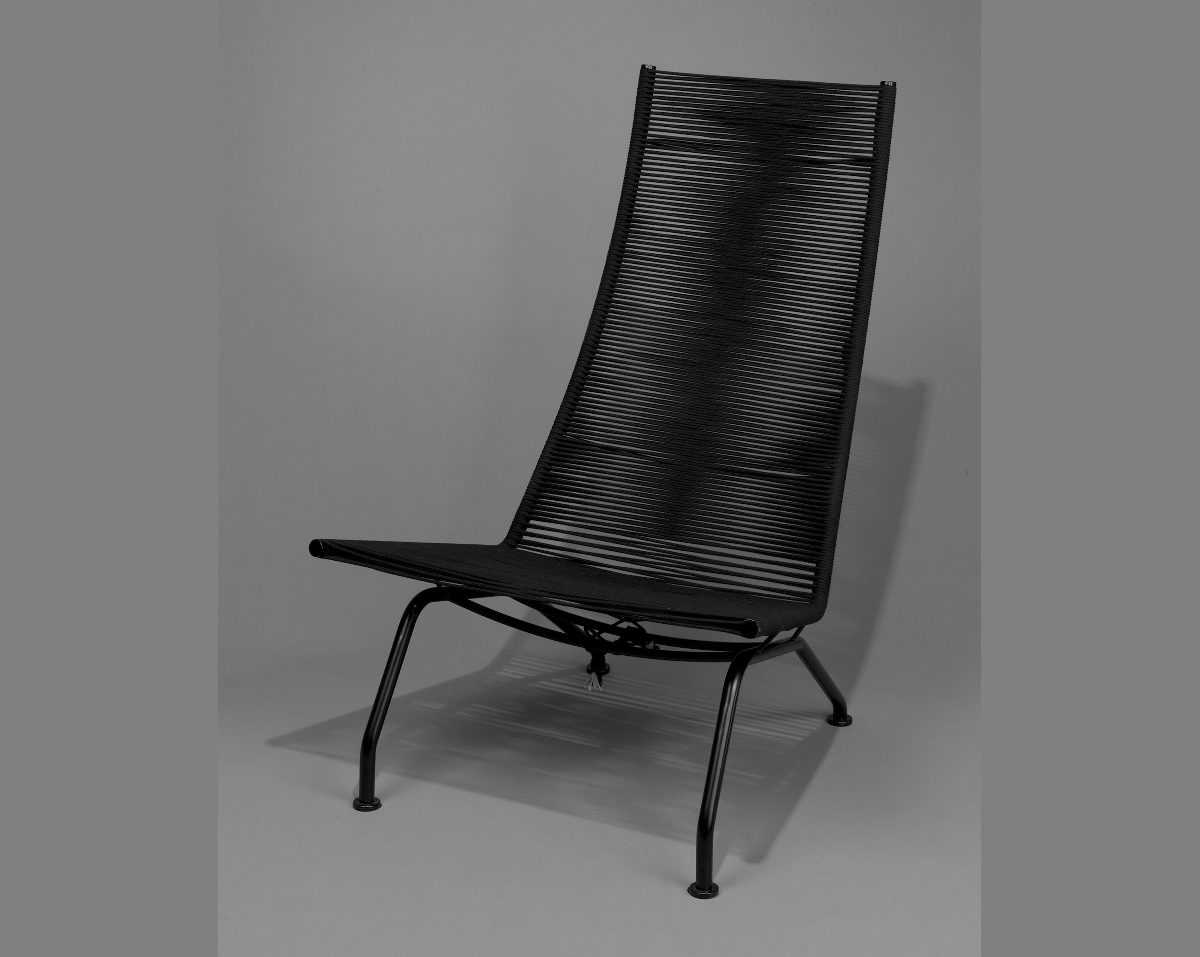
Chair 16 Concept
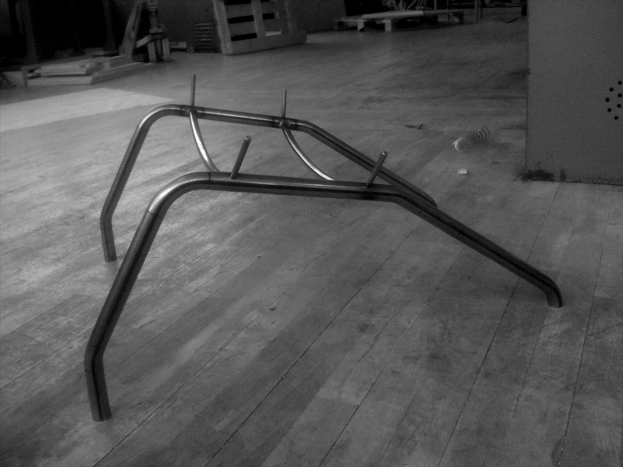
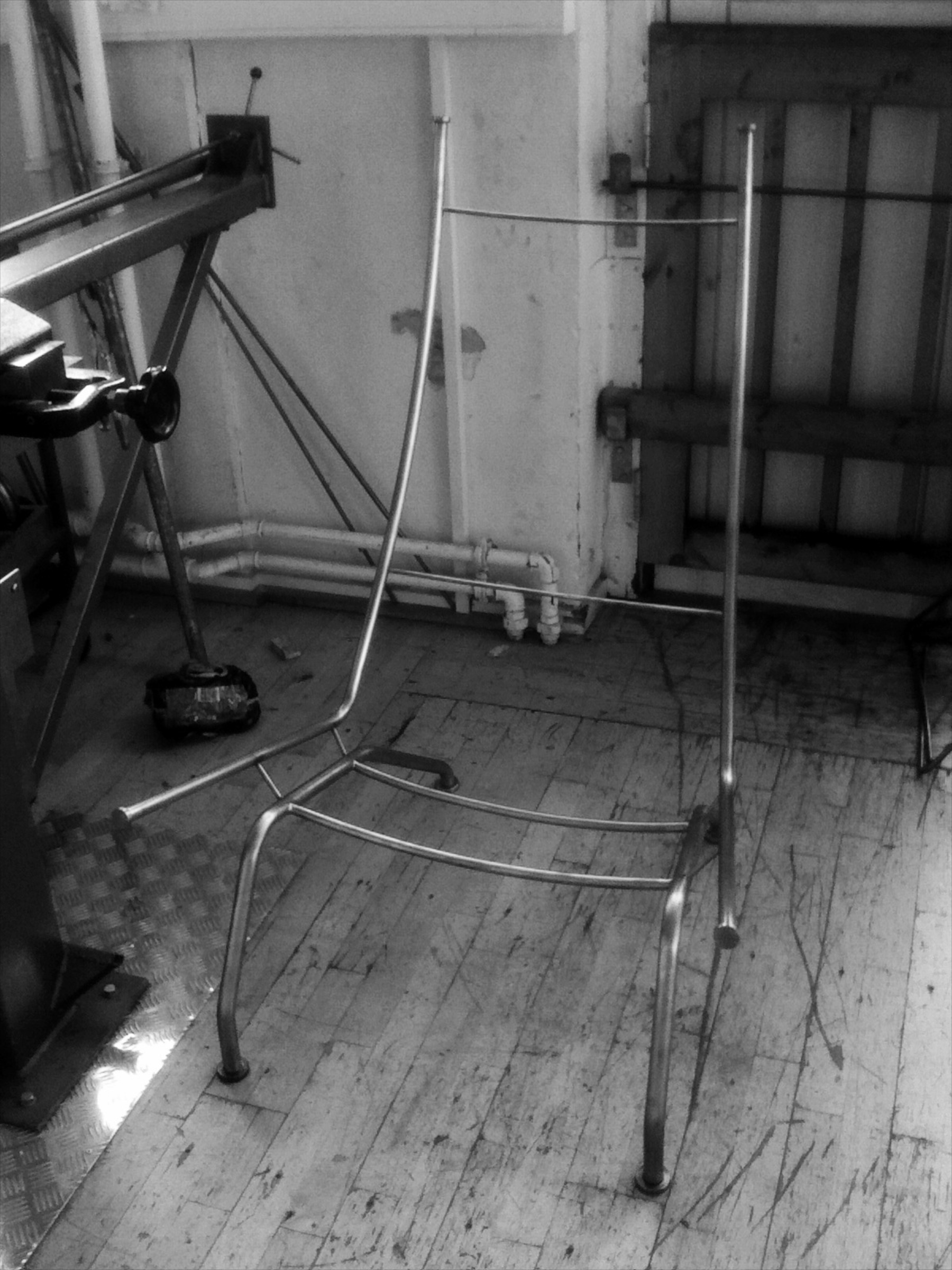
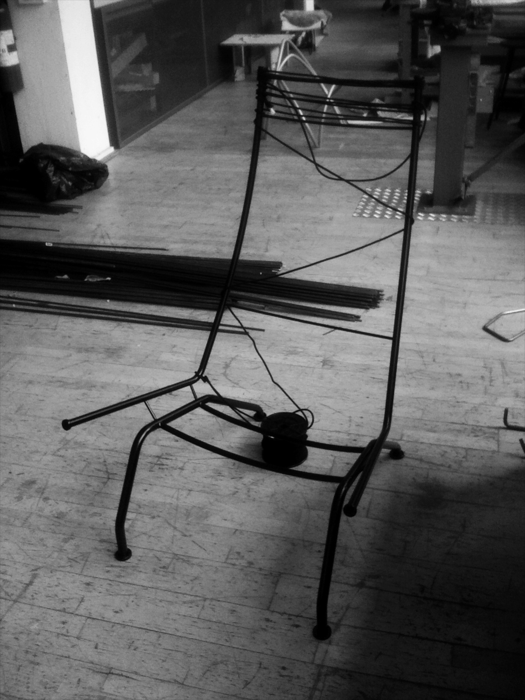
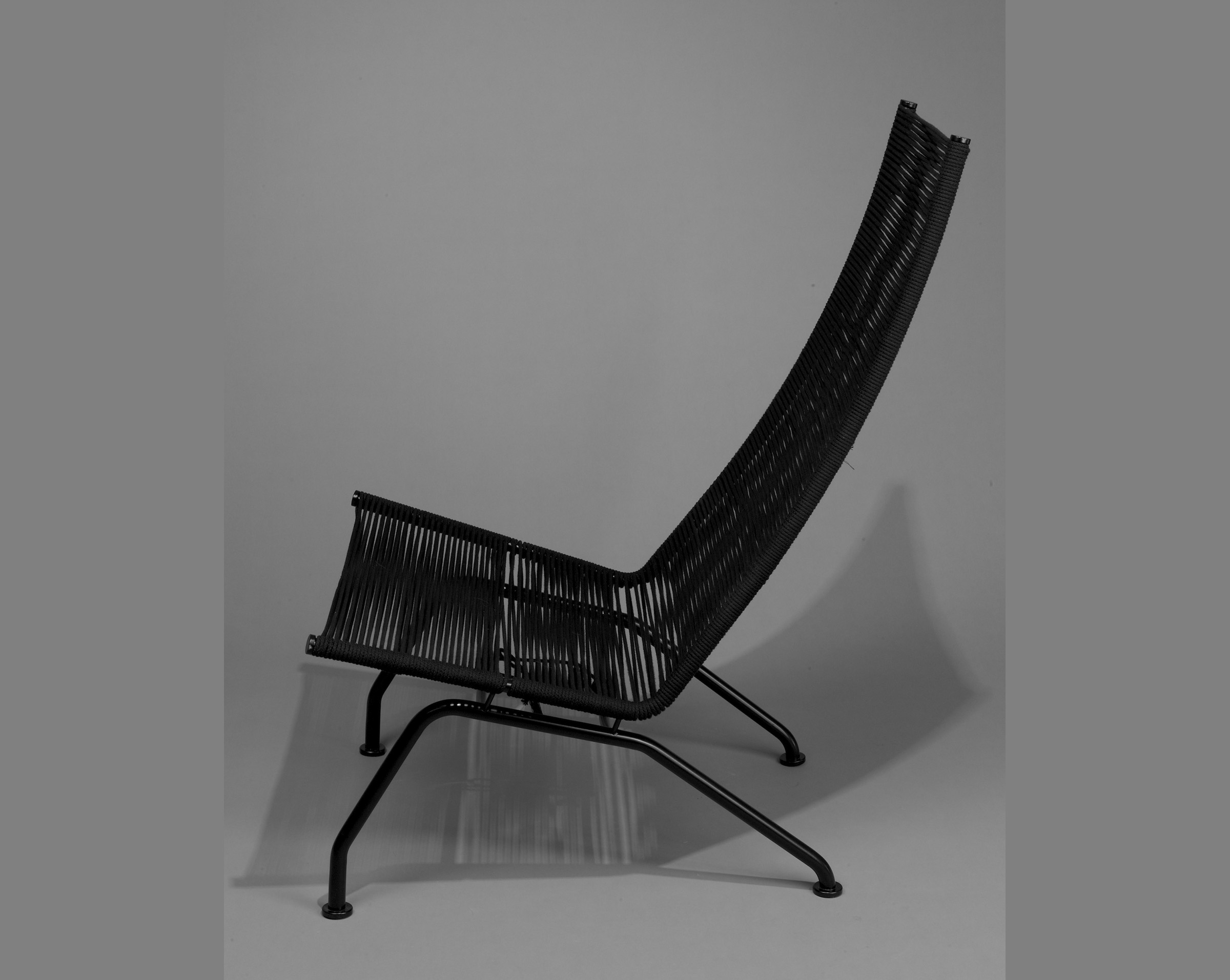
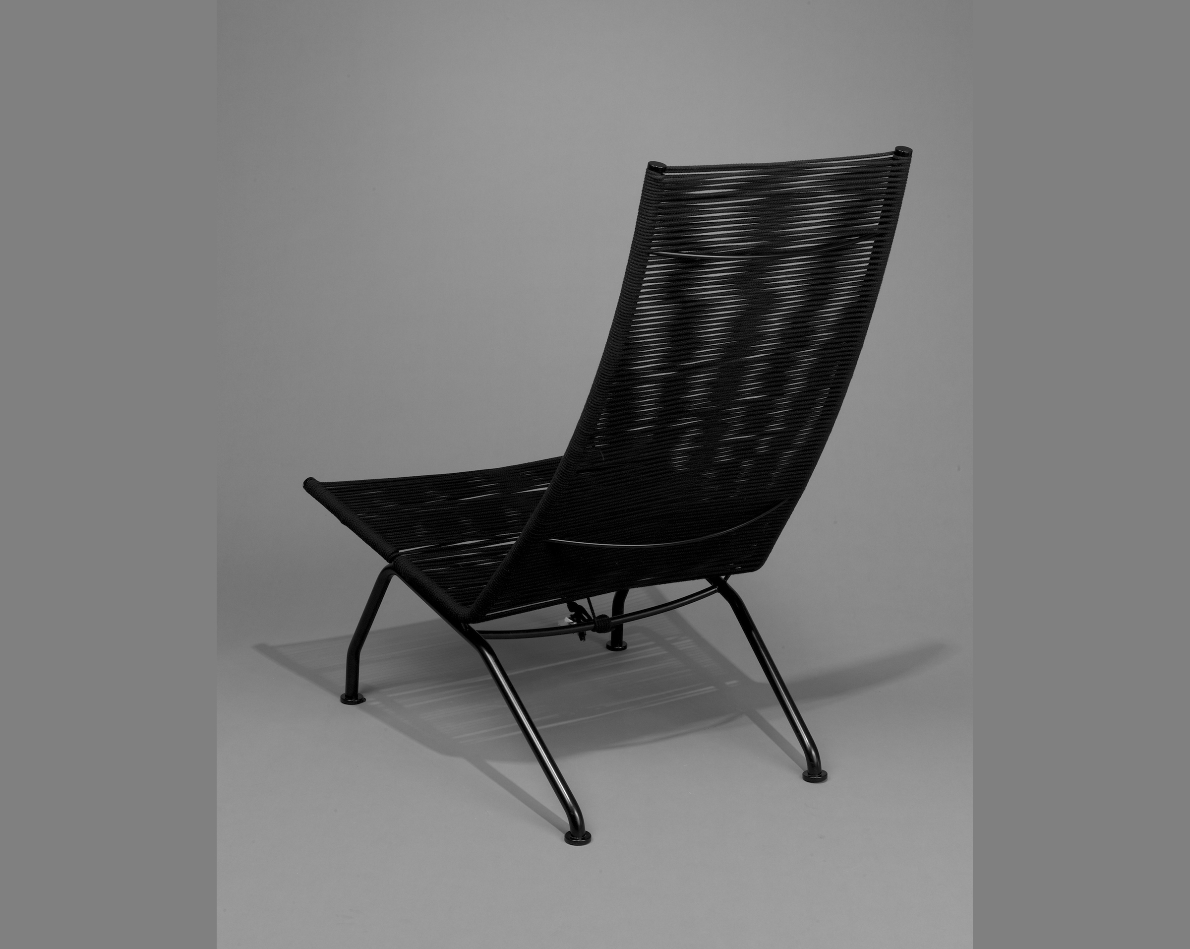
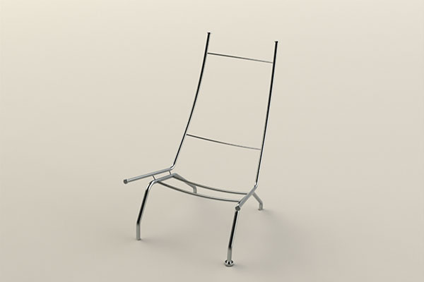
After spending the summer studying Scandinavian Furniture Design in Copenhagen, Stockholm and Helsinki, this chair takes cues from Poul Kjaerholm and Hans J. Wegner. The skeleton is made of steel tube and the seating surface woven with flag halyard.
Materials: Steel, Flag Halyard
First Concepts
Danish Institute for Study Abroad
Furniture Studio, Summer 2011
Initial Concepts
Within the first week of the program, before really getting to know Scandinavian design, we had to present three different concepts. The primary material that was assigned to me was steel tubing so naturally the first concept tried to construct the chair in one continuous tube with a suspended leather seating surface and an upholstered back.
The second concept was based loosely on the golden number but it really was not an idea I wanted to pursue. It featured wooden veneer seat, back rest and arm rests. As a result the primary material became sub-dominant. And in many ways, this chair looks like an old chair from school.
The third concept was some what more interesting. It was constructed of similar bent tubing connected together to form the surface with an alternative design that would replace the inner tubes with some sort of mesh seating surface. As I presented these designs to the instructors, it was clear by their facial expressions that these concepts were not exactly “Danish” nor more loosely, “Scandinavian”.
Initial Sketches
For a long time, I could not pin down why I did not understand what makes a piece of furniture “Scandinavian”. If one looks at furniture from the great designers: Kaare Klint, Poul Henningsen, Arne Jacobsen, Finn Juhl, Hans Wegner, Verner Paton or Poul Kjærholm, there is no obvious aesthetic or style. And it really was not until we toured numerous factories, studied and sat in as many chairs as I could in showrooms in Copenhagen, Stockholm and Helsinki, did I realize that the overall theme is actually a philosophy of combining simplicity, functionalism and craftsmanship.
Exploring Scandinavian Design
Spotting a Flag Halyard Chair finished at PP Møbler with my telescopic lens
The first chair that really peaked my interest on our tour was Hans J. Wegner’s Flag Halyard Chair. I first saw it in Allerød at PP Møbler with its “out-of-this-world” looks, beach-lounging seating position and rarity, this was my dream chair.
However, in my mind, I was really looking for something a little bit more upright; something one can relax in but at the same time carry a conversation with someone in the next chair. Then on the last day in Sweden, this chair caught my attention.
CH468 in a showroom in Stockholm
It turns out CH468 was also designed by Hans Wegner and had exactly the sitting position I was looking for so I decided my chair would have its metrics.
3rd Round Refinement
The first model started out where the third initial concept stopped. Since the stance of the chair was now based on CH468 the configuration of the legs needed to change. I had not figured out what would be a suitable seating surface yet so a wooden veneer was modeled.
Evolution
Some point during the tour, I decided that my chair would be Danish. Afterall, I was in Denmark, the design process and the prototyping stage were to be done in Denmark so why should I not fully submit to the culture and the aesthetic that was around me? This lead to an easy decision. I was also going to use flagline to weave the seating surface especially since I liked the Flag Halyard chair so much.
Poul Kjærholm's PK1
With the help of a fellow DIS student from Denmark, I figured out the flagline I needed is produced by Århus Possementfabrik A/S. Unfortunately they were closed for summer break so I scoured Copenhagen for supply. Just as I was about to give up, a friendly showroom staff at Nyt I Bo gave me the contact information for Thomas Bruun Olsen, owner of Bruun Olsen Flet, a specialist in restoring old chairs and as I found out later, the weaver of all new Poul Kjærholm PK1 chairs.
A woven flagline seating surface may appear uncomfortable at first but it depends on the resolution of the weave. The closer together the lines are, the more it starts to resemble a real continuous surface. One clear advantage of this for me is the cooling effect the negative space between lines provided, very similar to the mesh used on Aeron chairs by Herman Miller. As a person who is constantly warm, a cool surface like this would be ideal. And as Hans J. Wegner had suggested:
“one should put a pelt on the chair if one is bothered by drafts.” - Sieck, Frederik. Dansk Møbelkunst. Nyt Nordisk Forlag, 1999. 85. Print
So, a new round of refinement was drawn up.
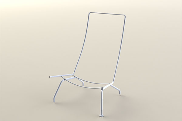
Side profile, Solidworks Rendering
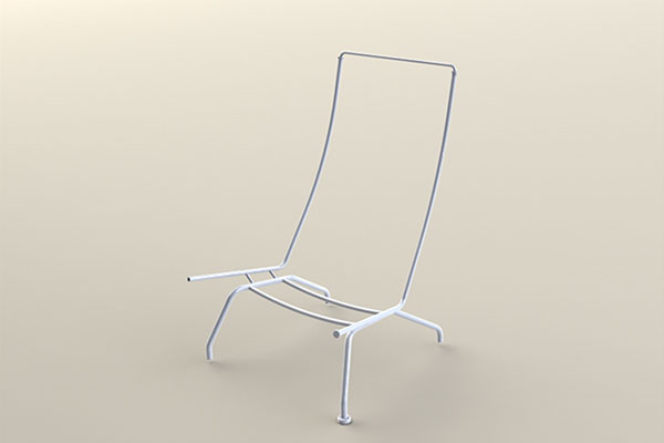
Solidworks rendering with Foot Rest
Refining the Frame
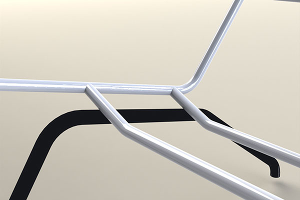
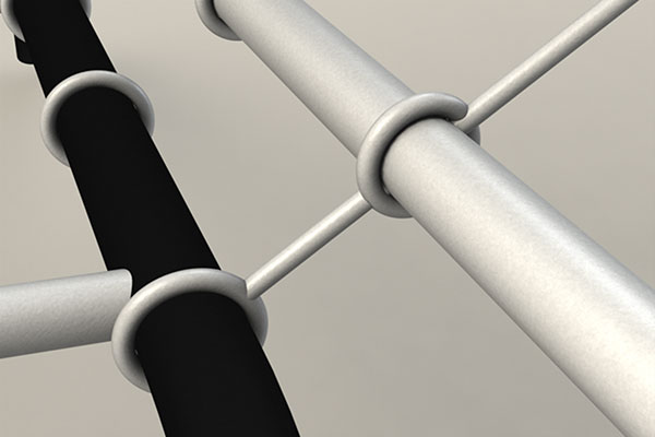
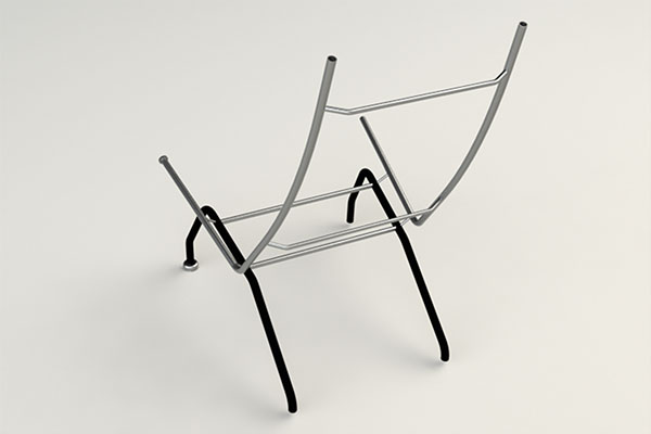
Aesthetic and structural considerations drove the design of the frame. While untested, the frame was designed to withstand atleast the load of atleast a 300 pound person while being as simple, yet asthetically clean, as possible.
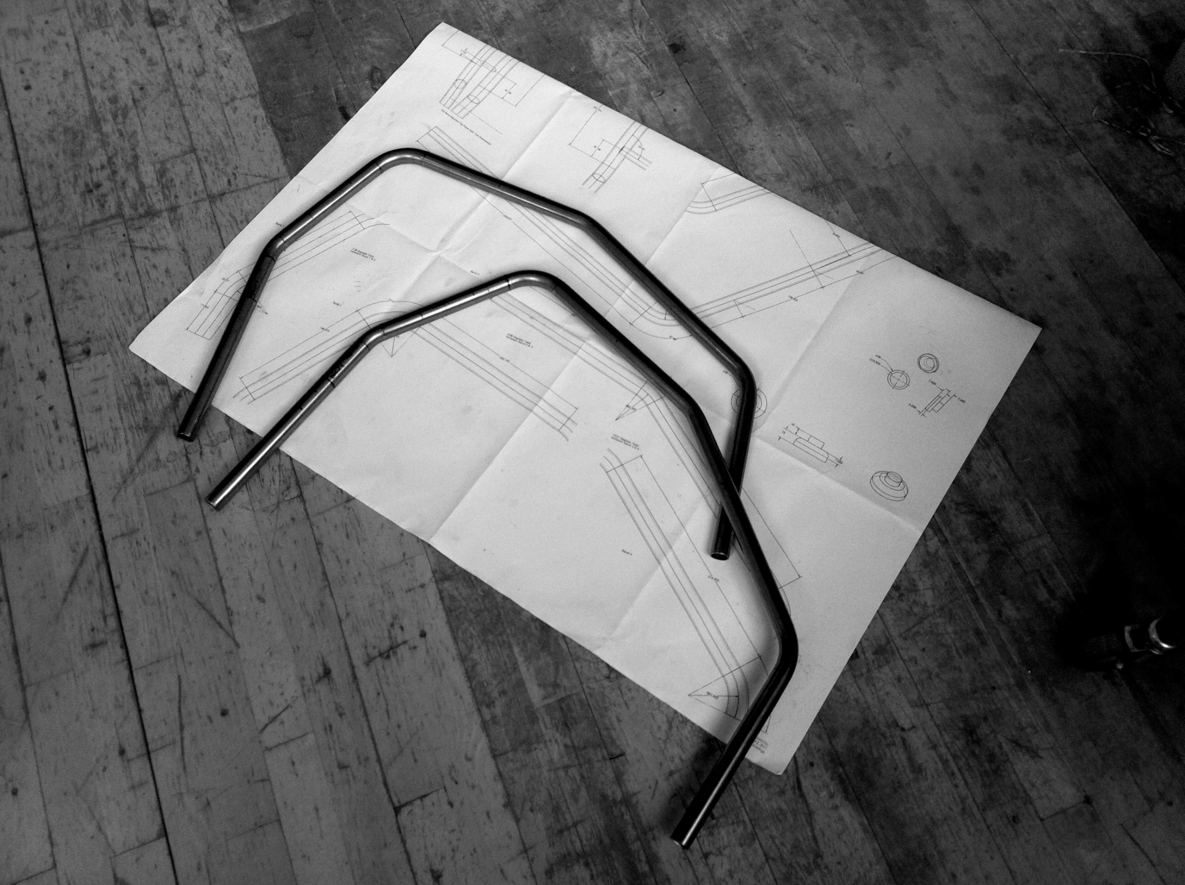
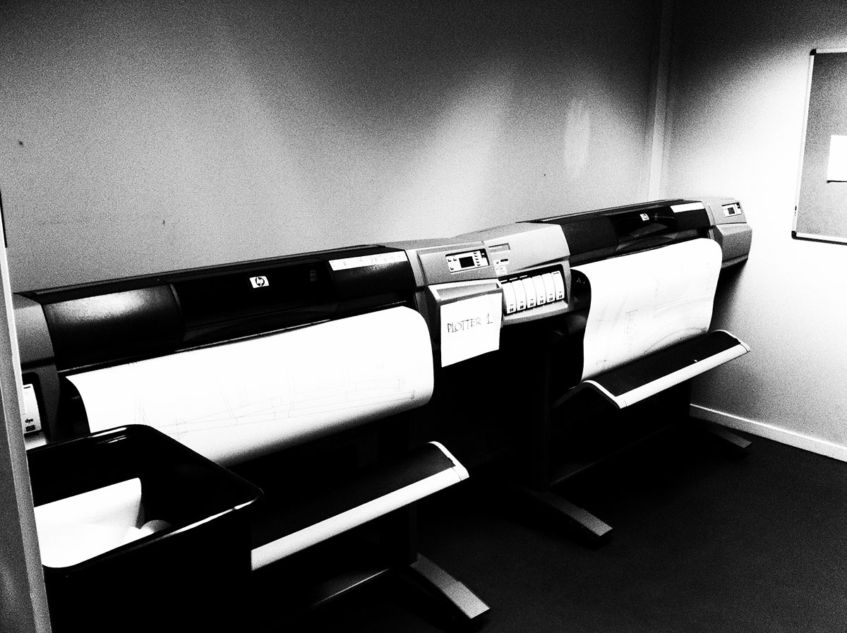
Working drawings were produced at 1:1 Scale
Since the prototype would be manually produced in the DIS shop, 1:1 working drawings were produced. In-plane, true-view drawings were also produced to aid in the process.
