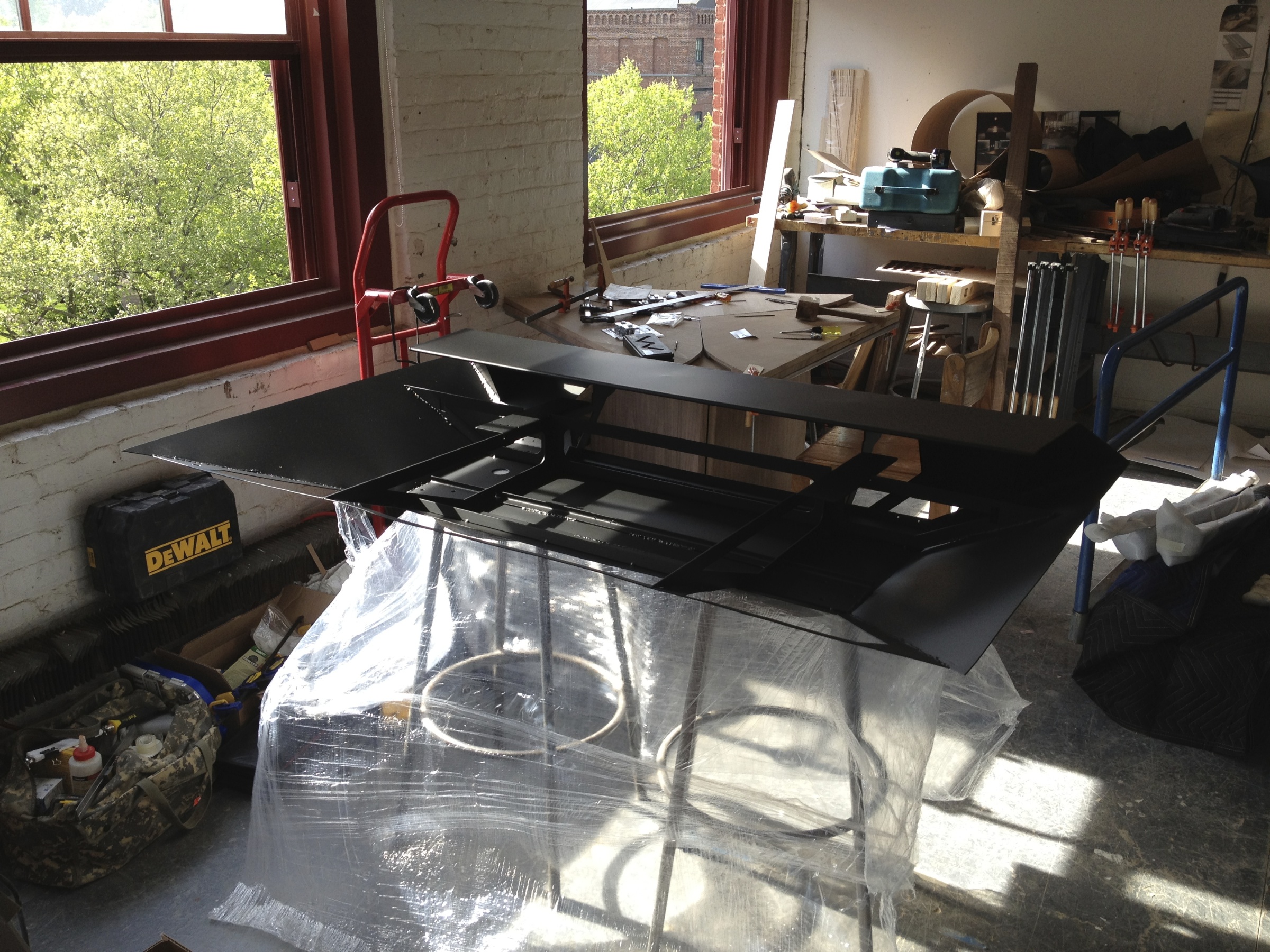
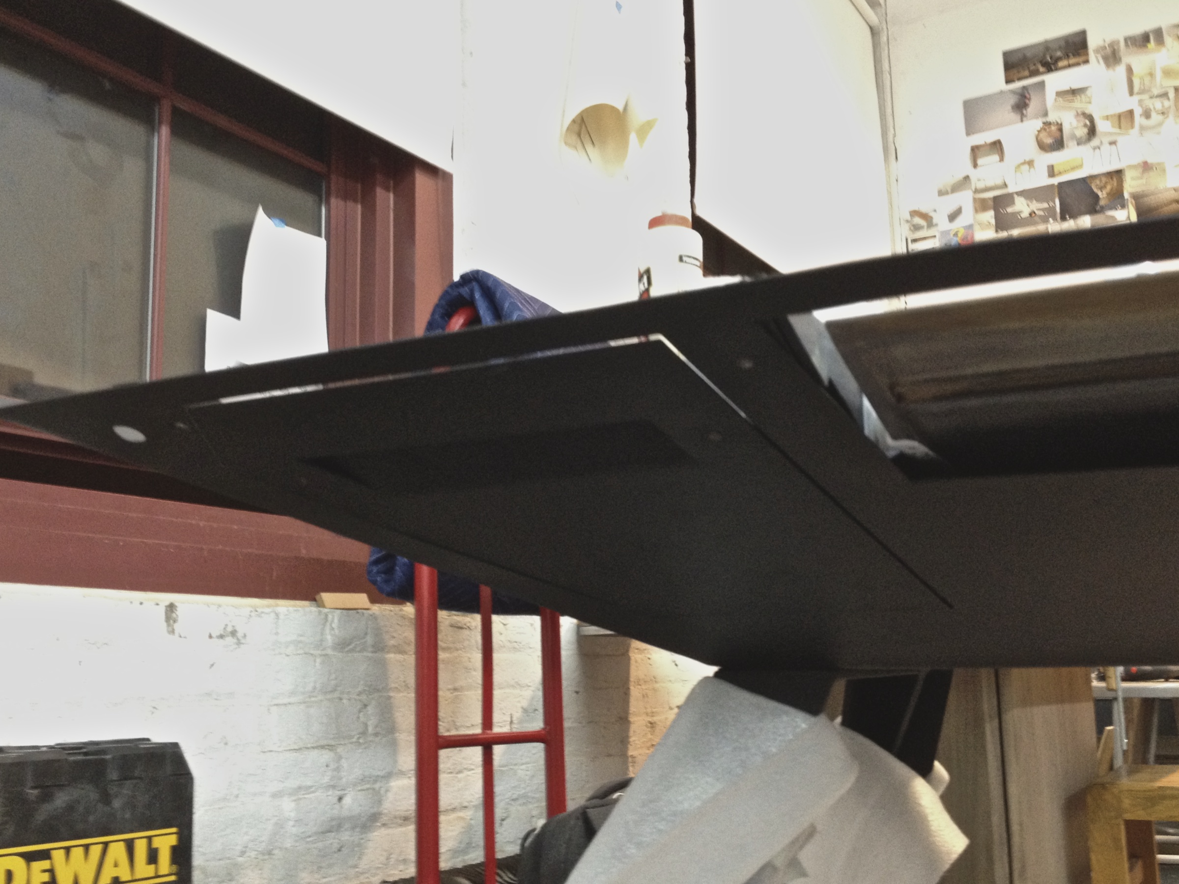
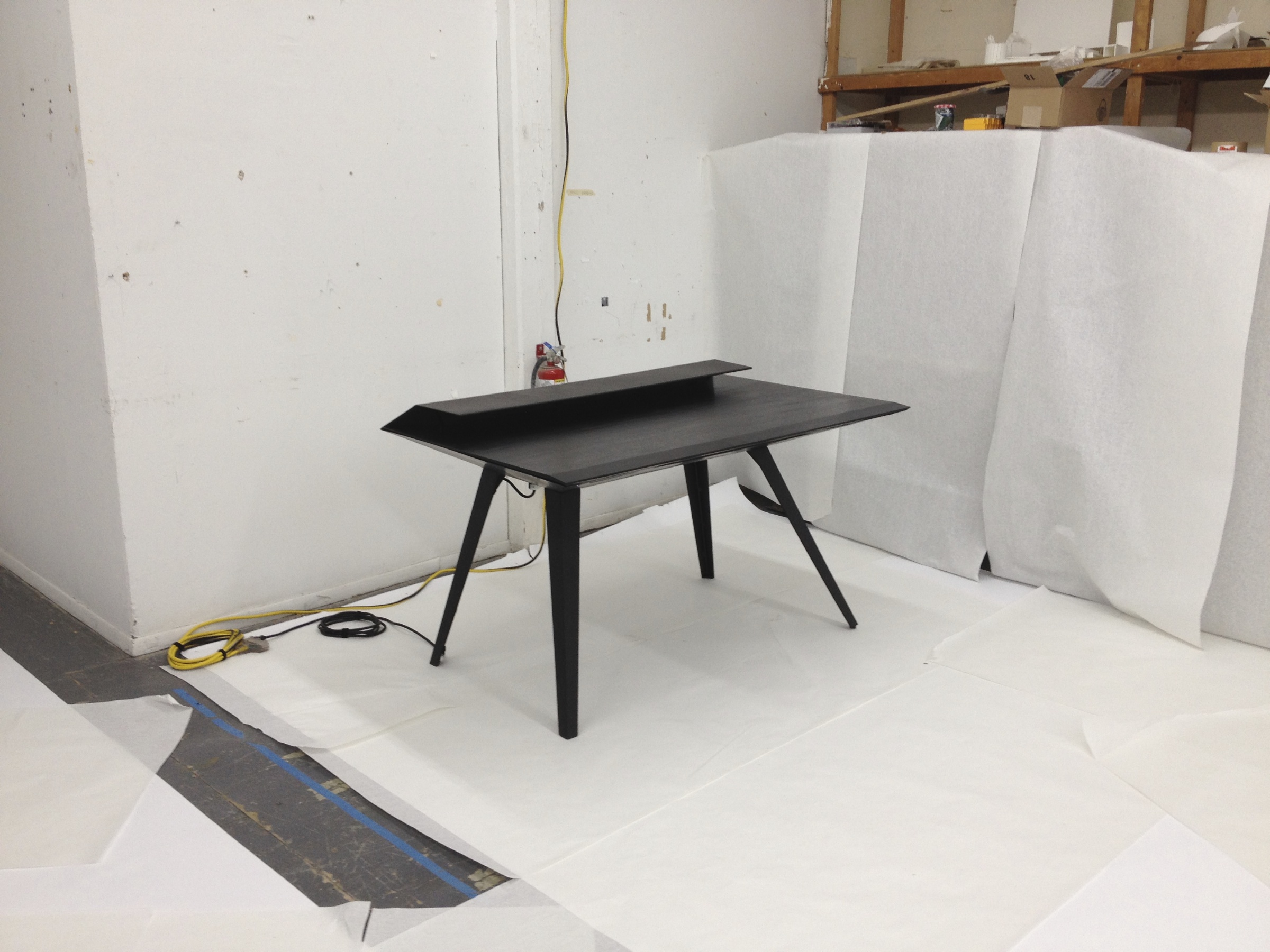
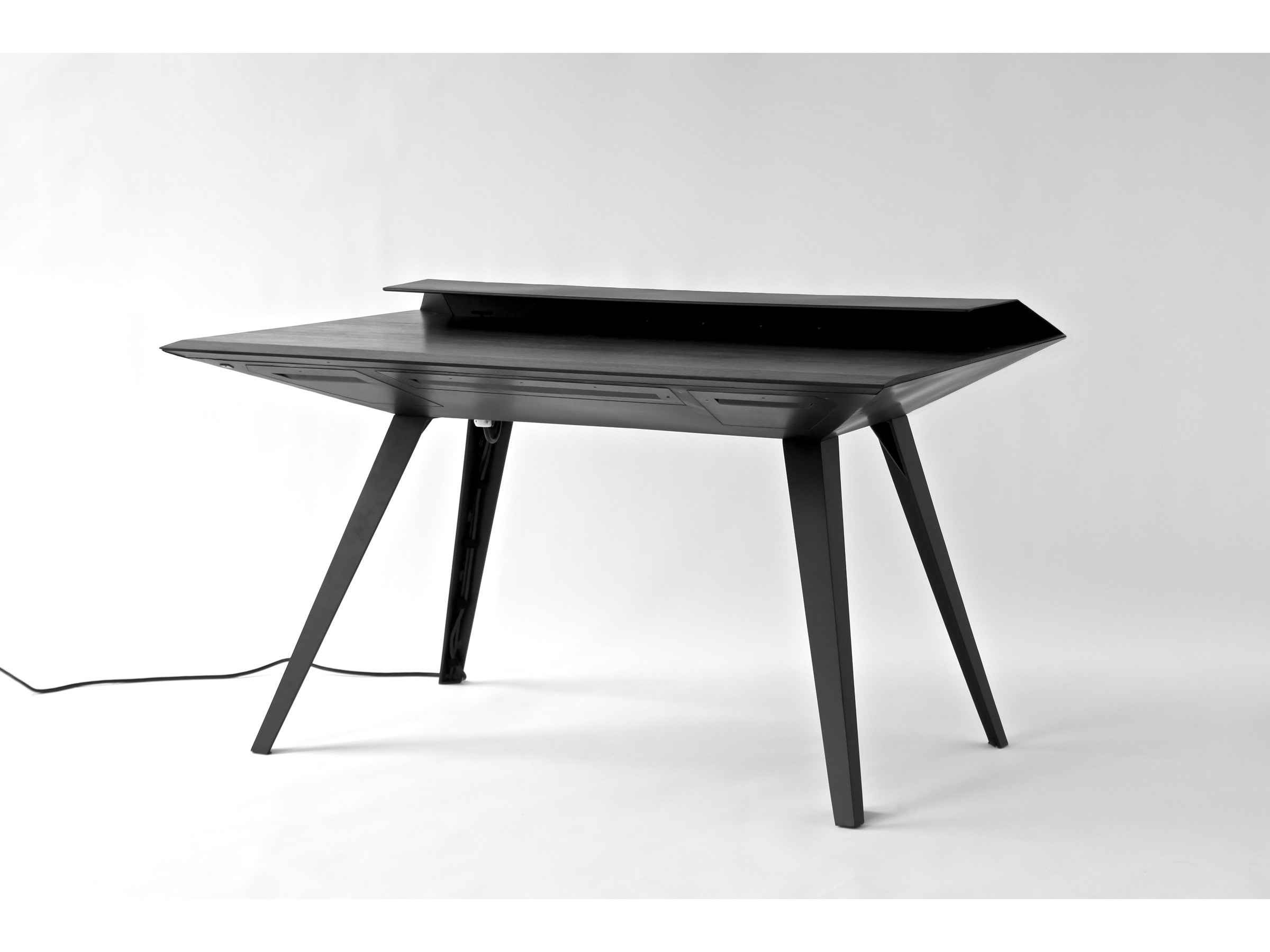
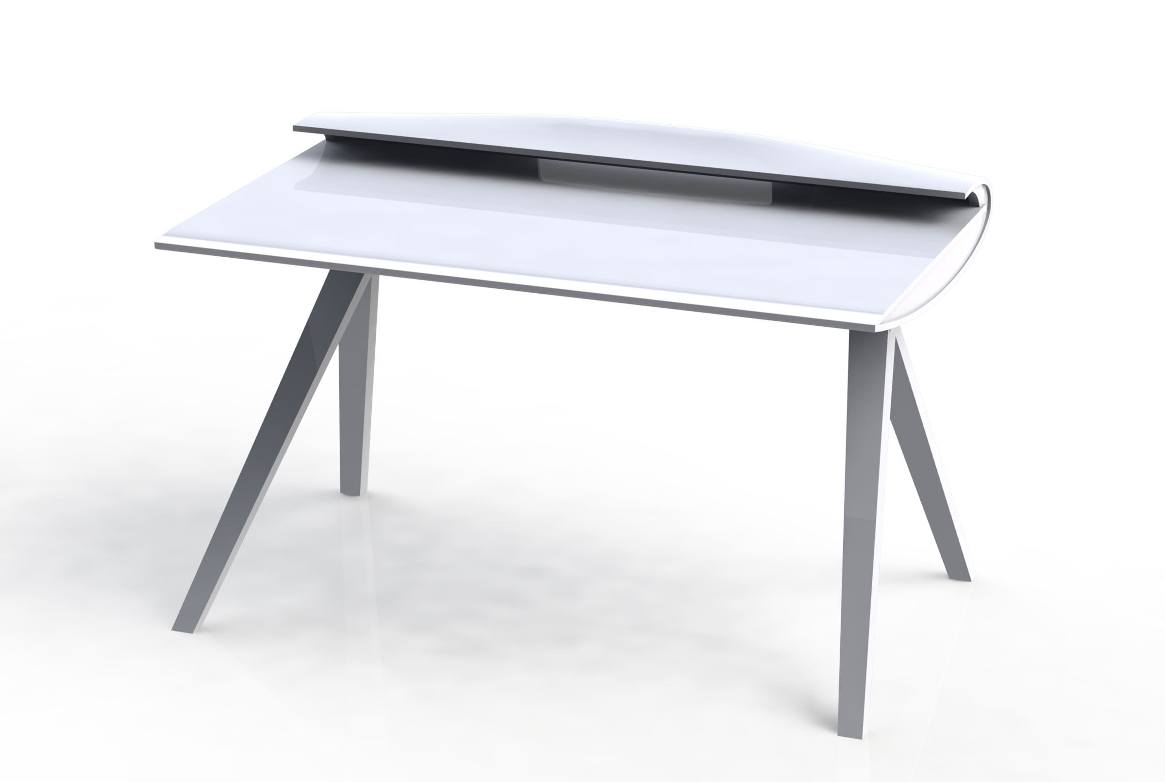
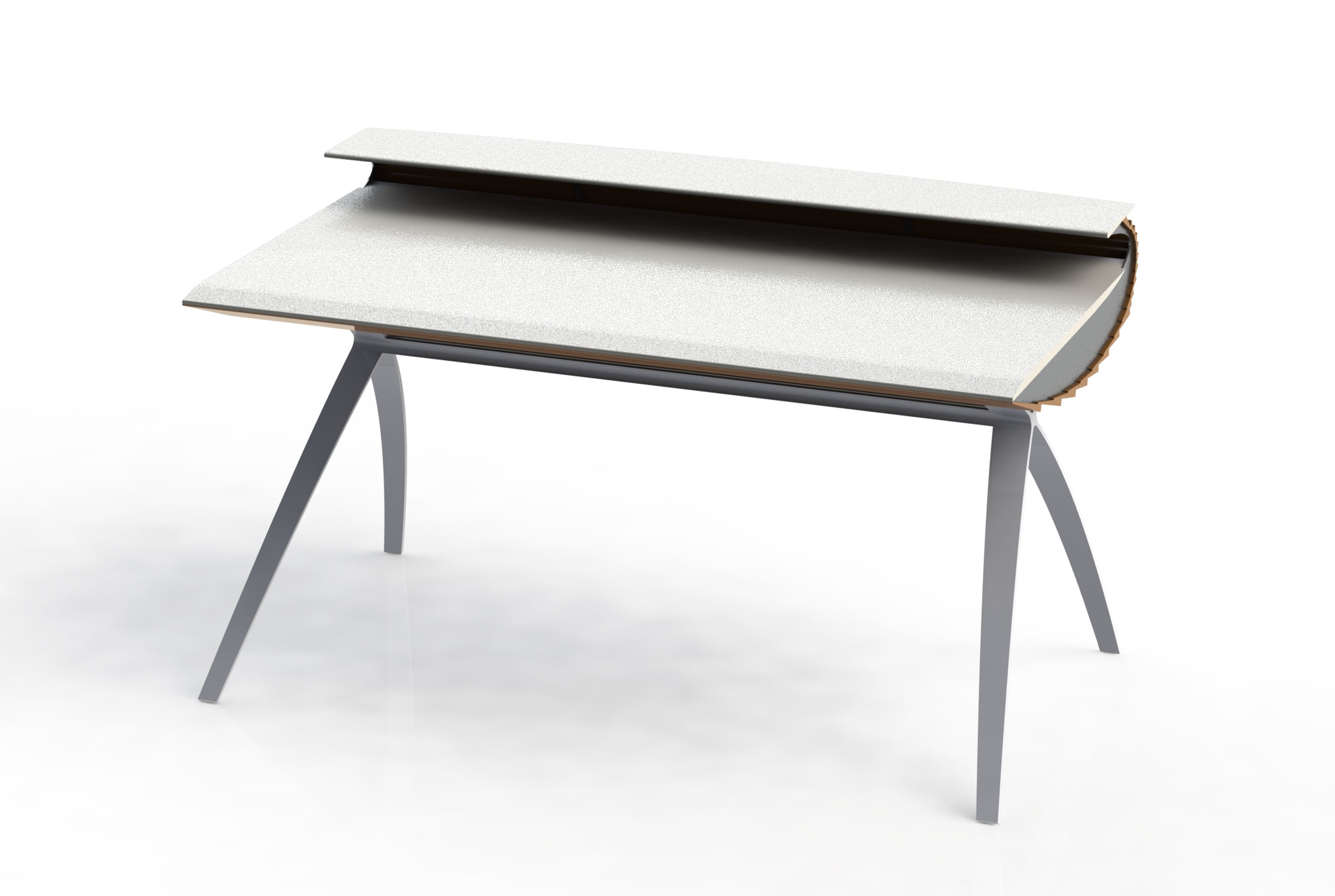
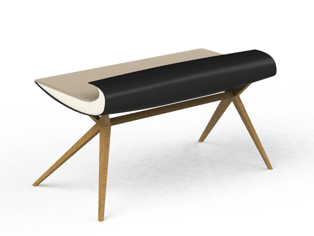
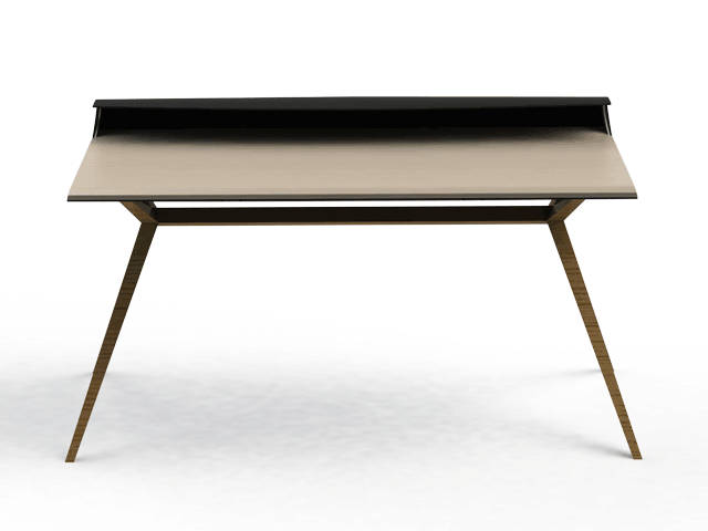
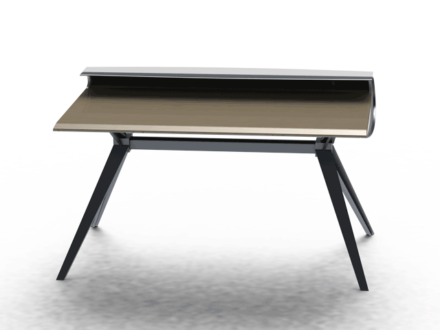
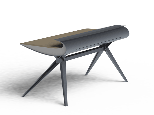
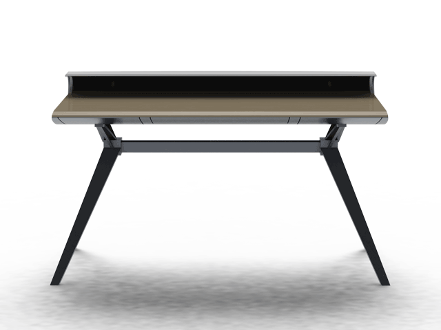
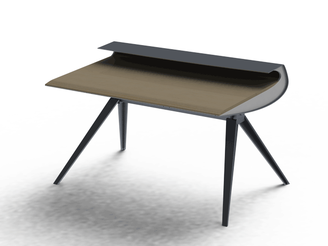
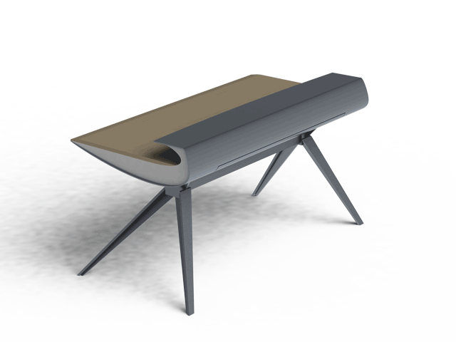
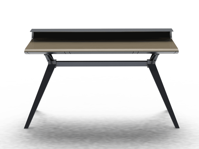
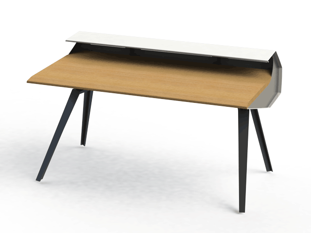
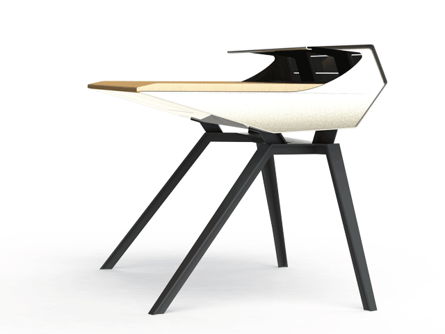
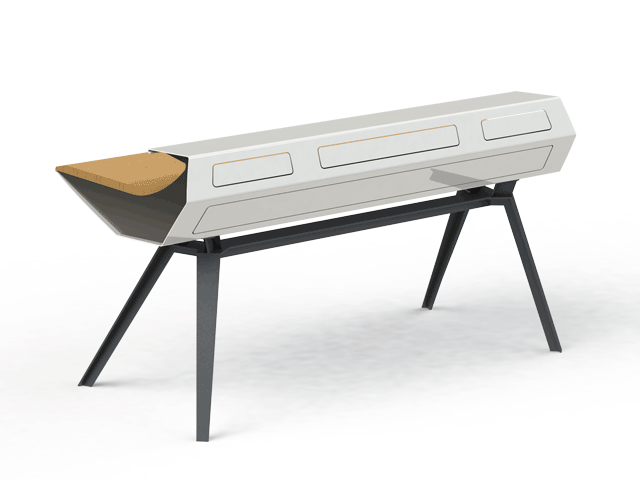
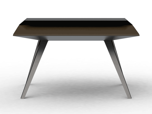
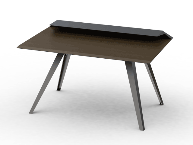
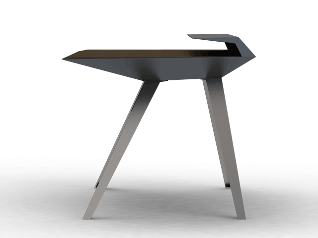
Desk 117 Concept
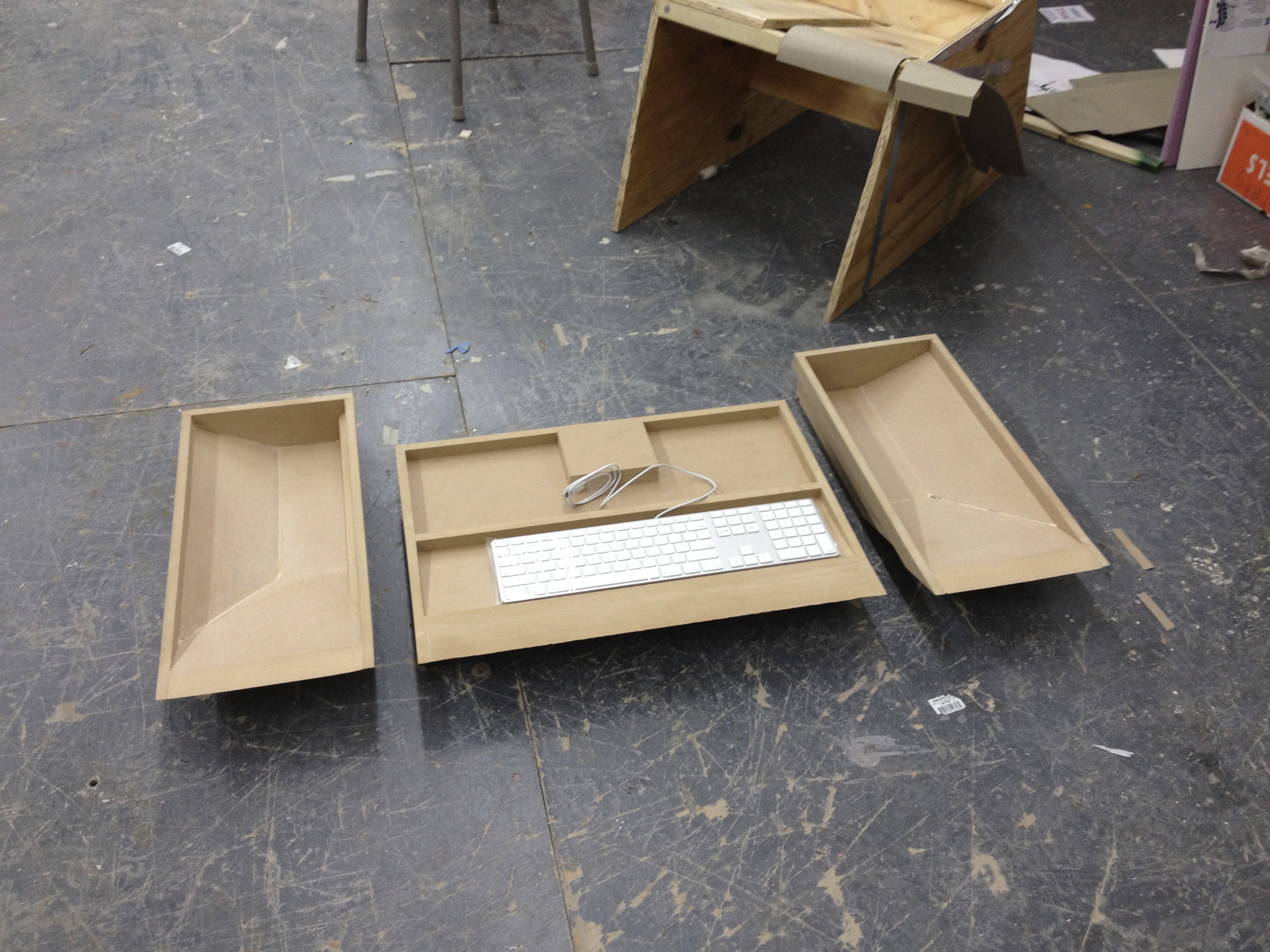
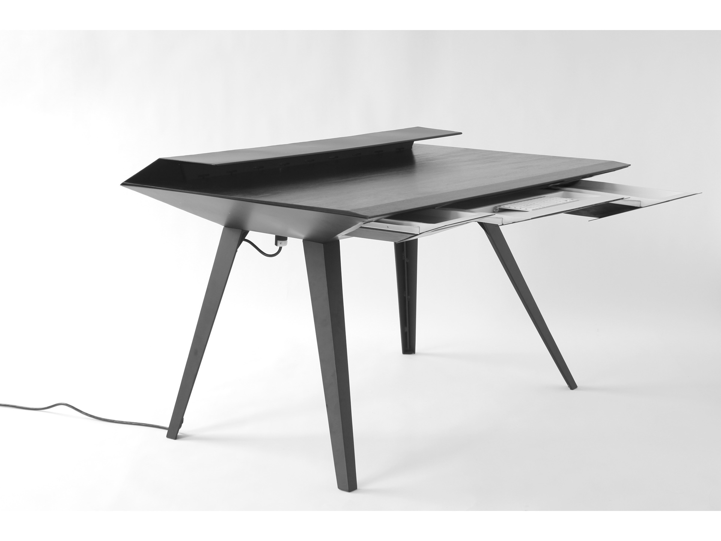
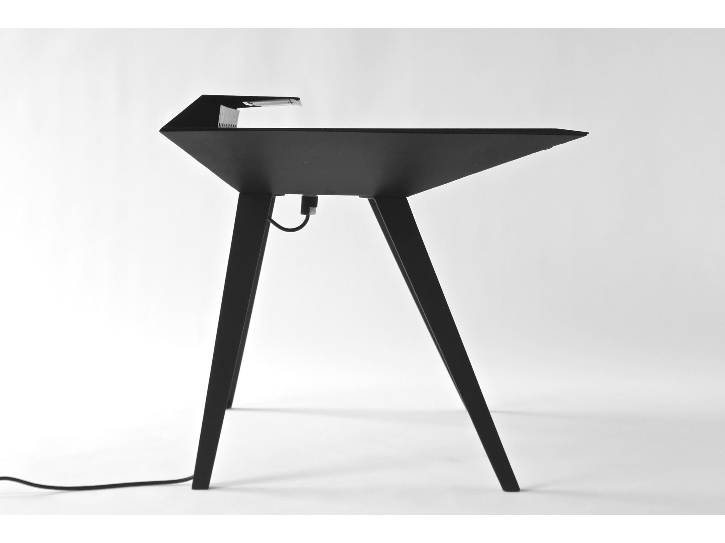
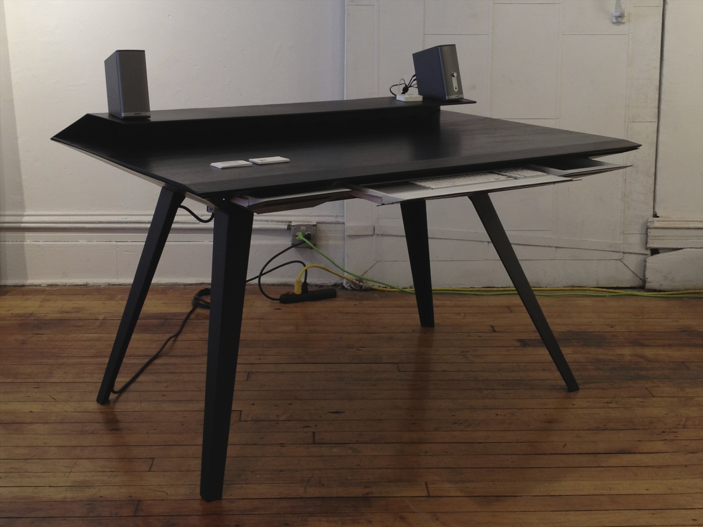
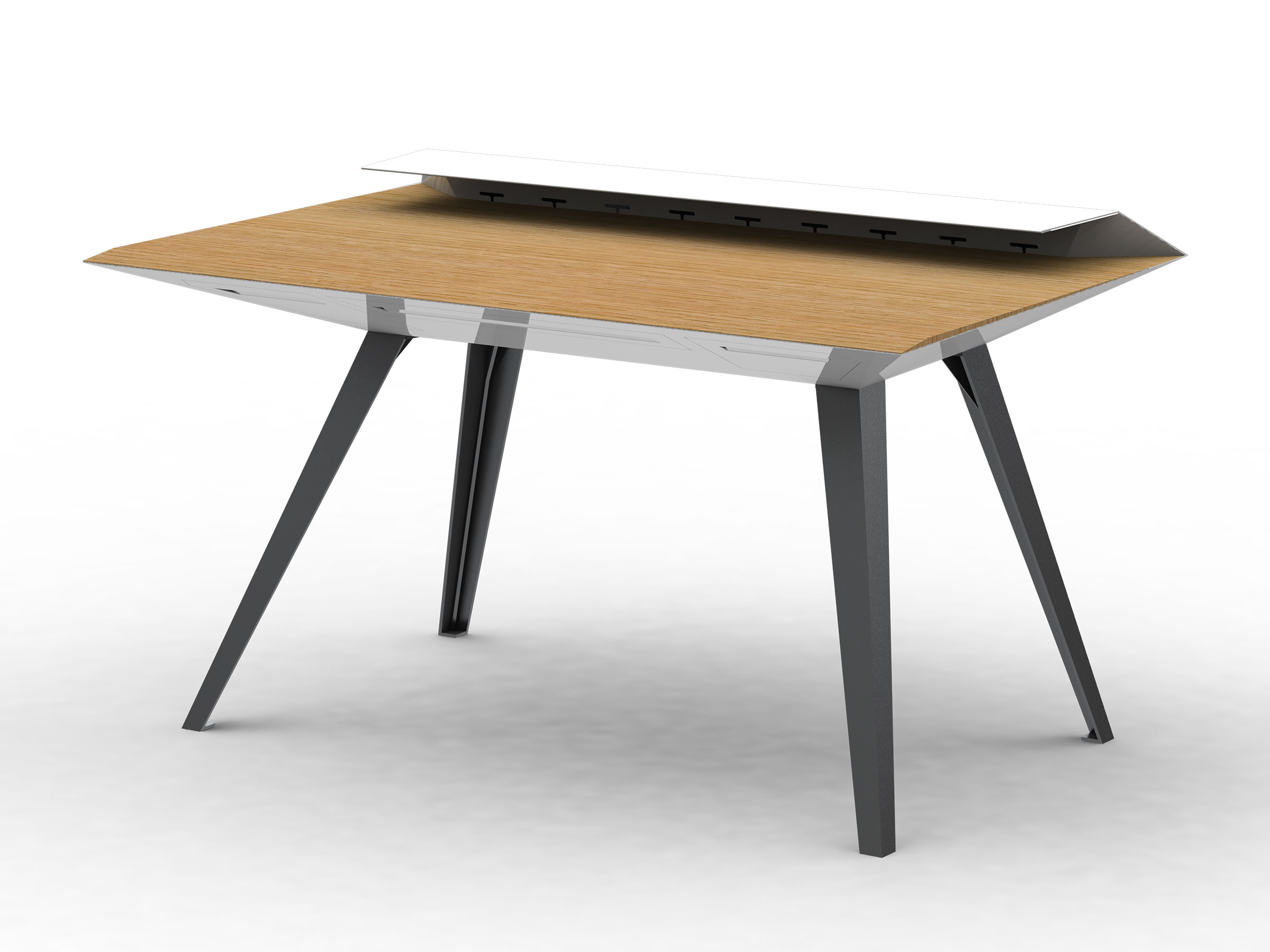
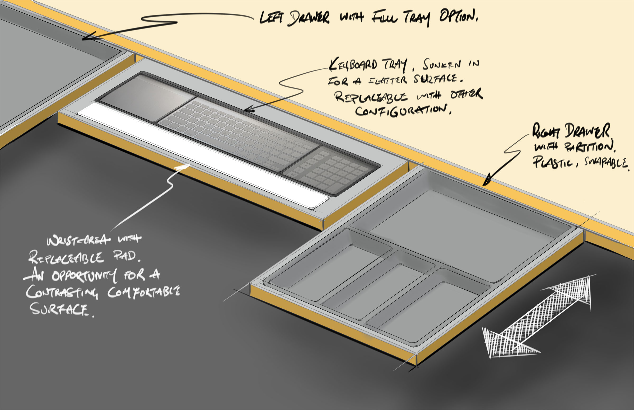
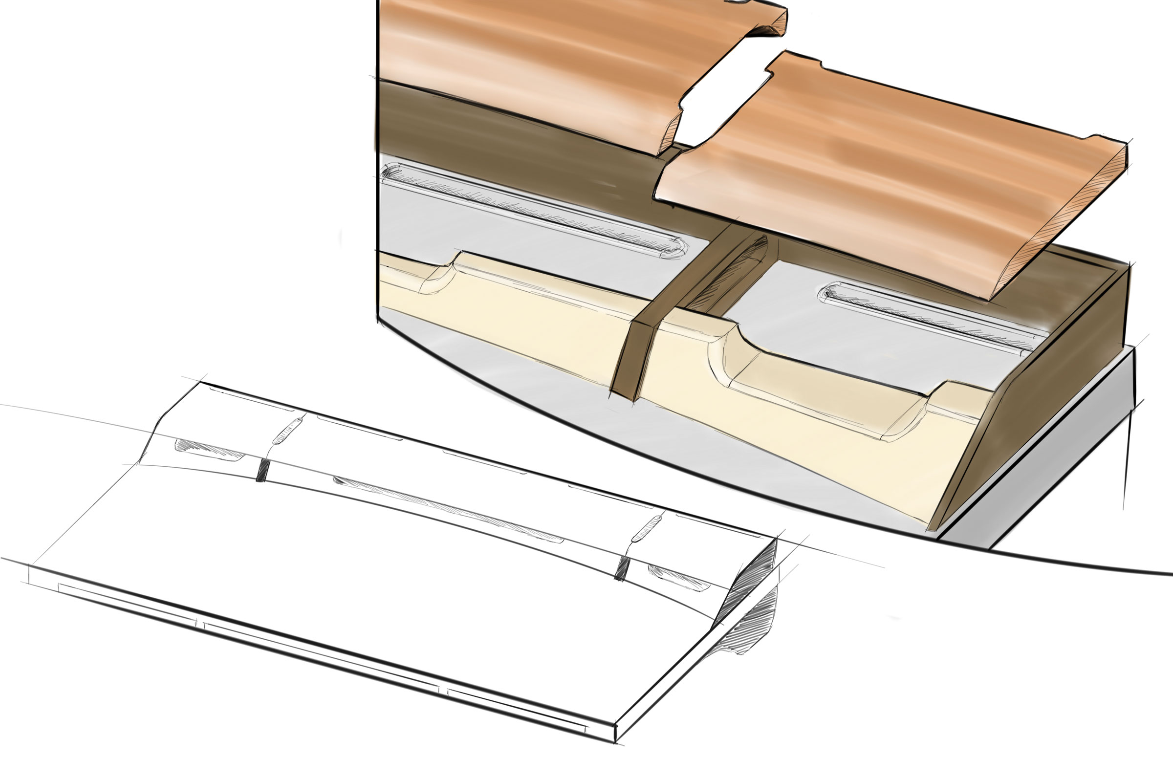
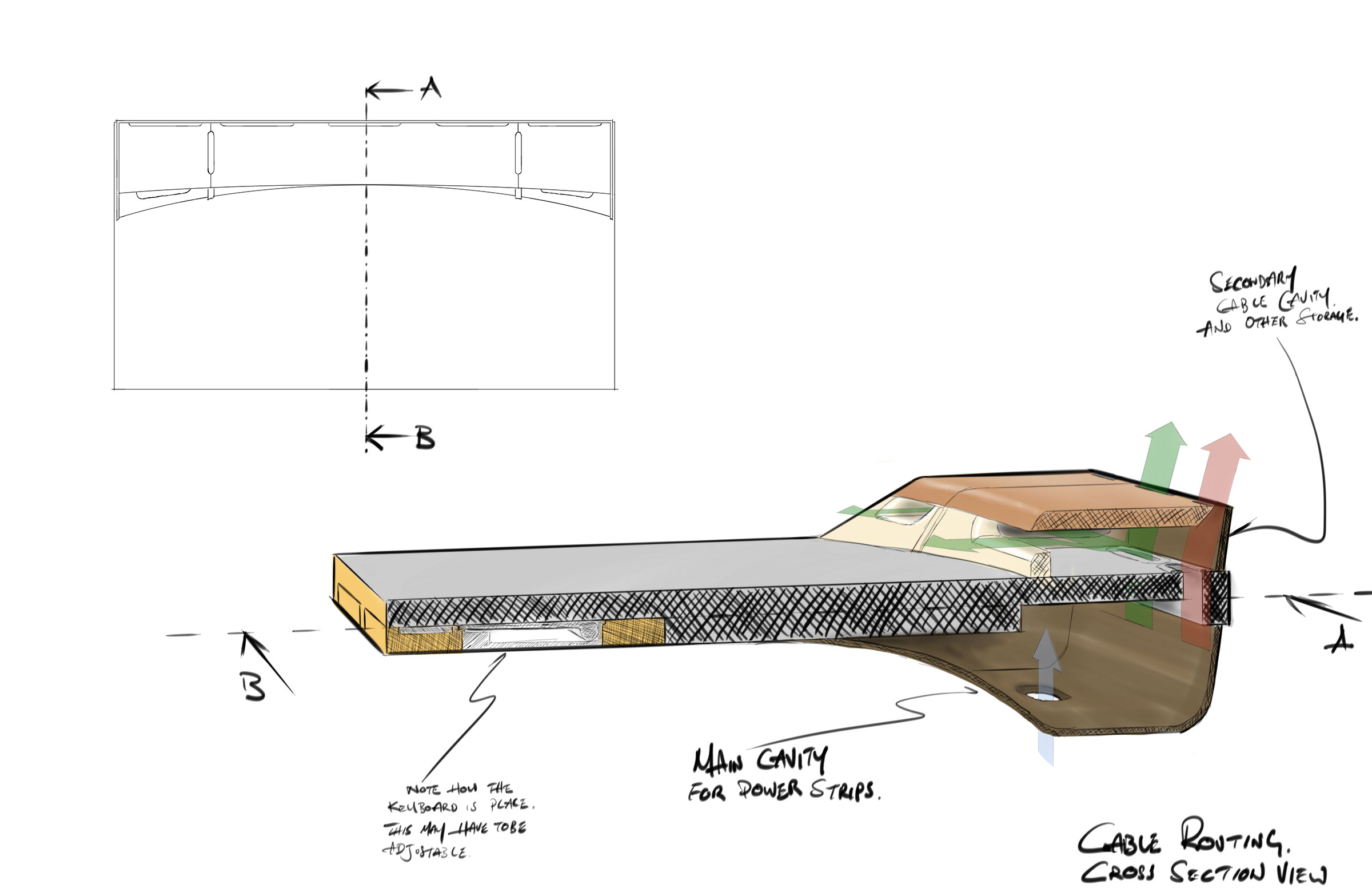
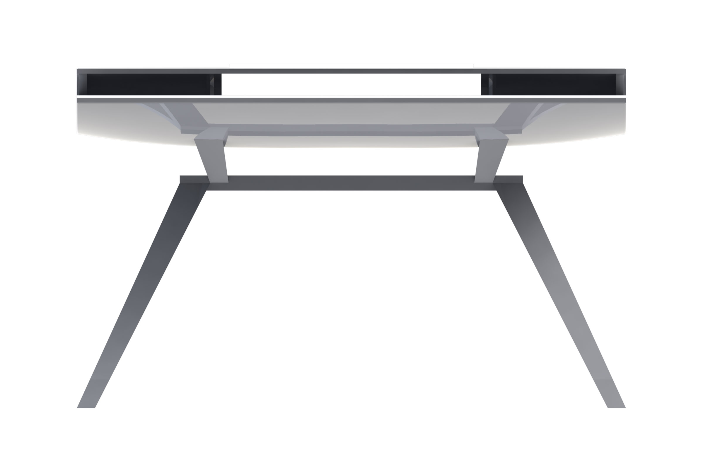
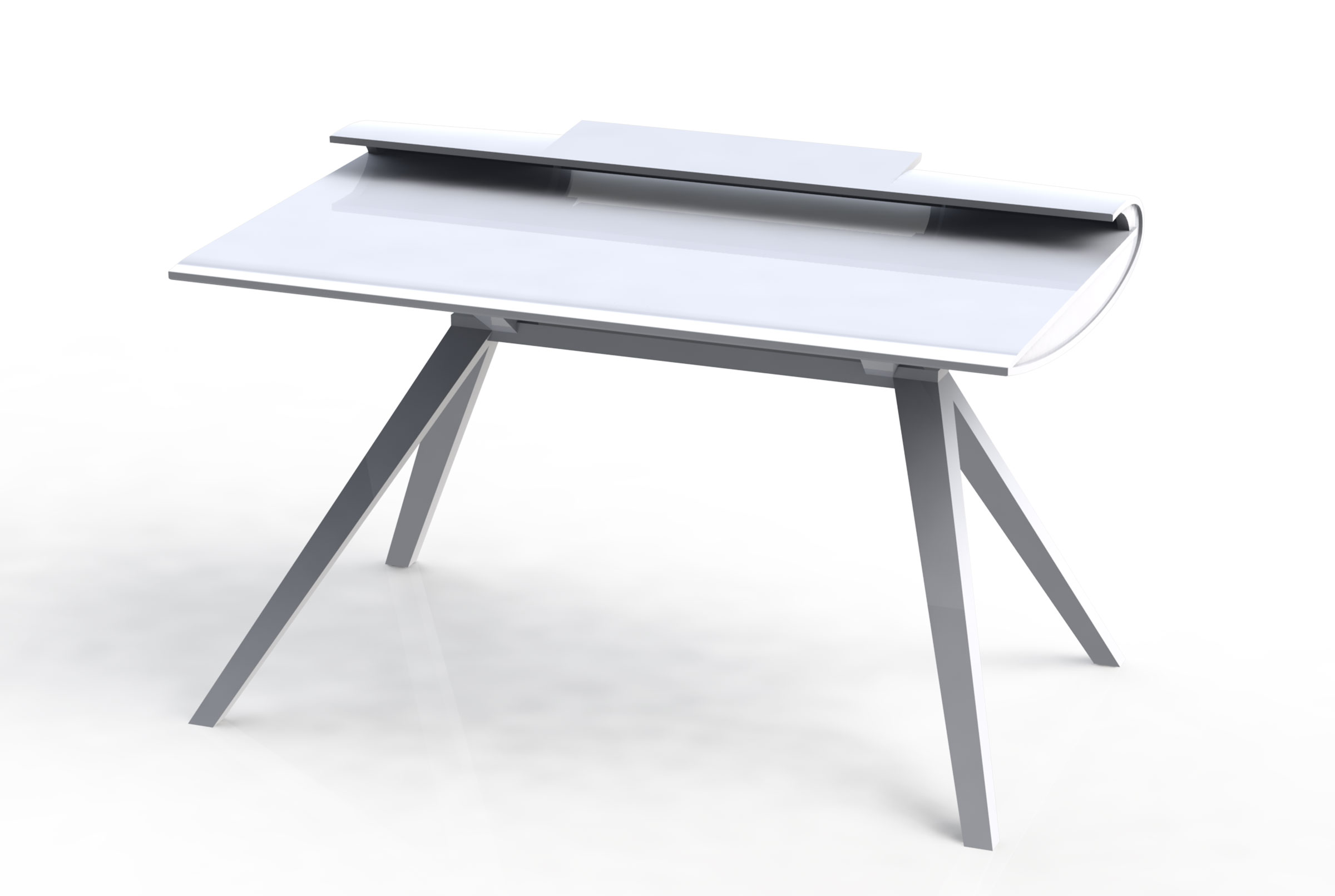
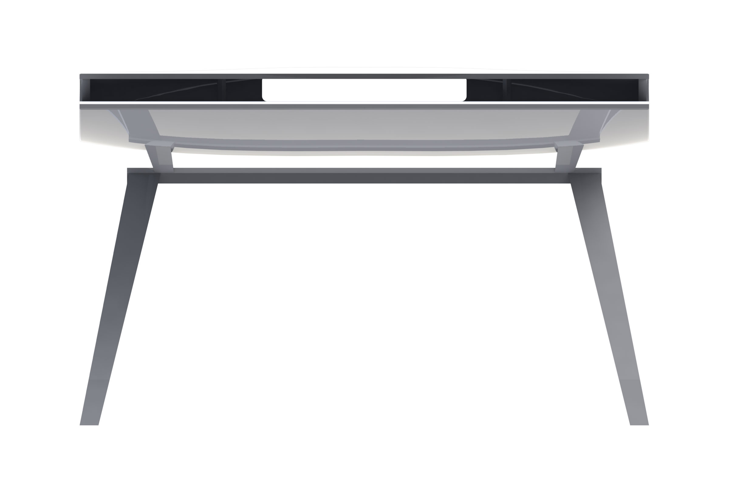
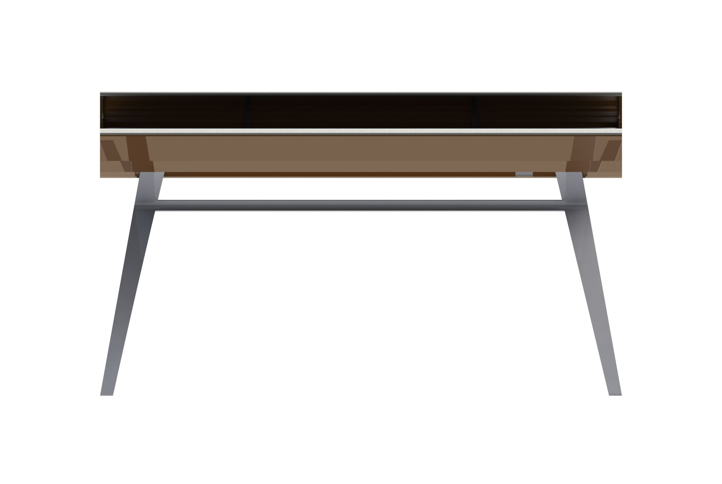
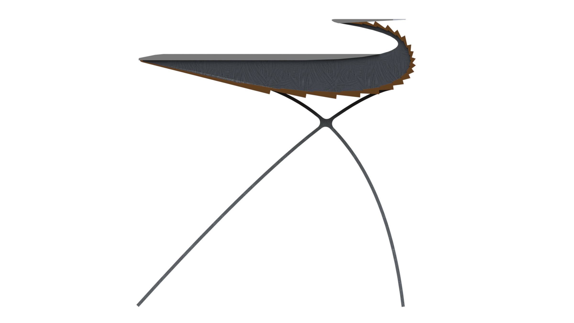
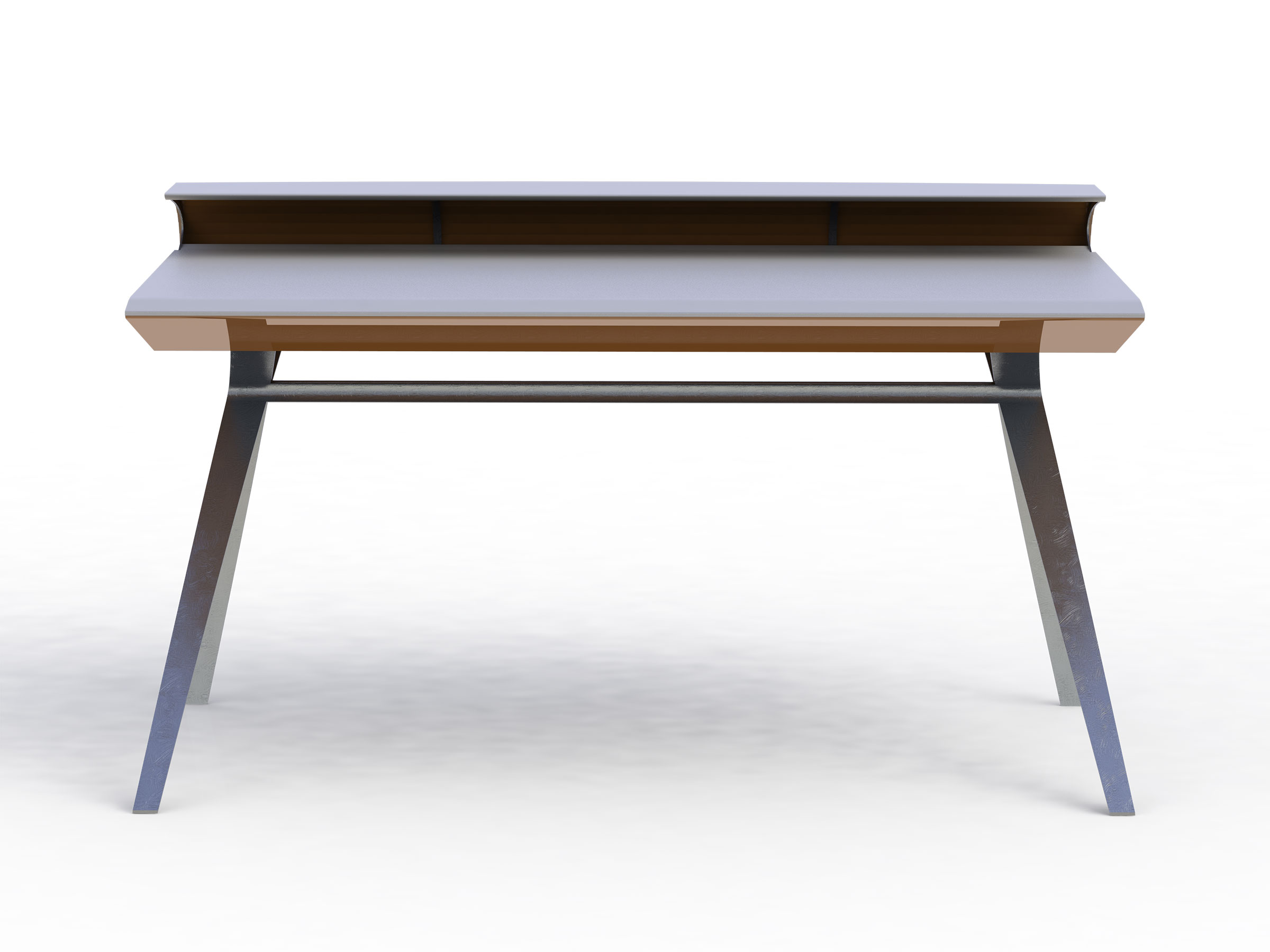
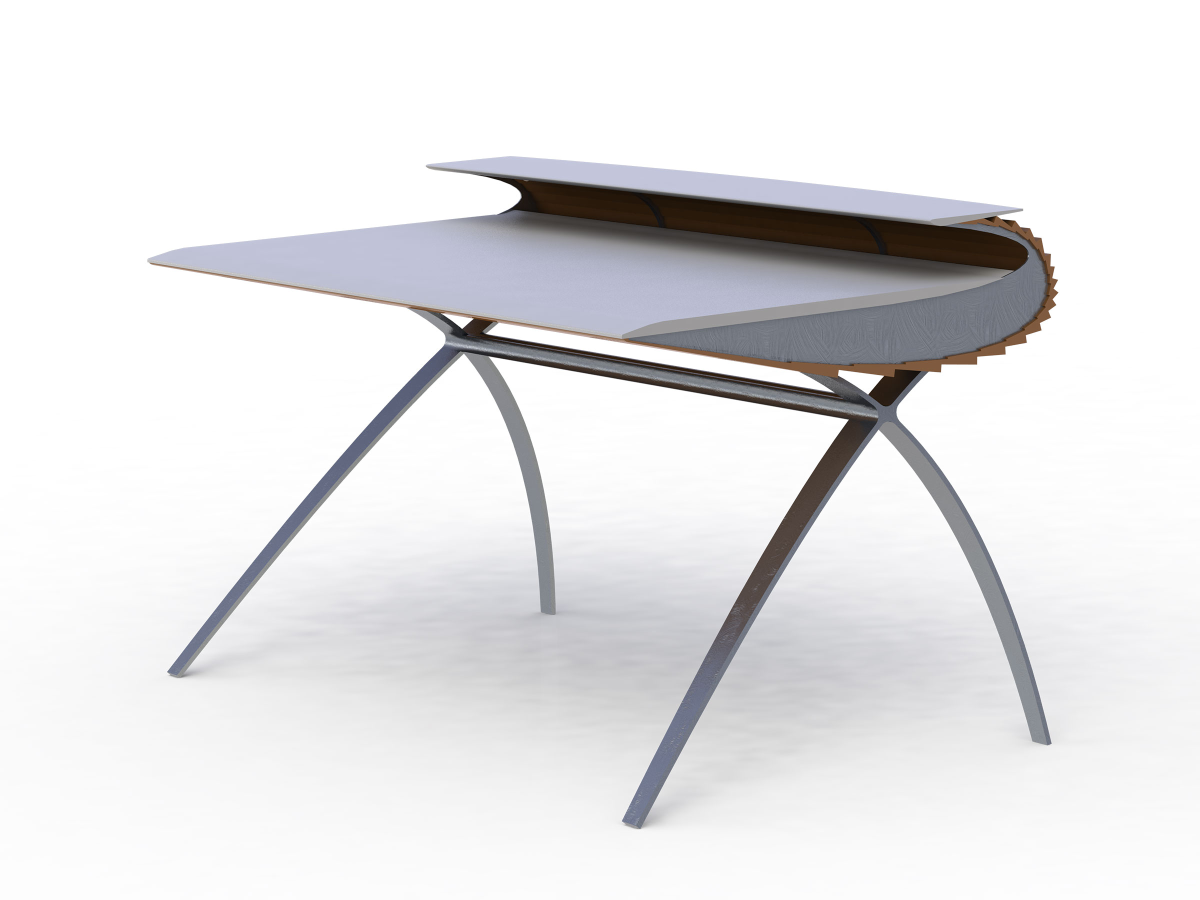
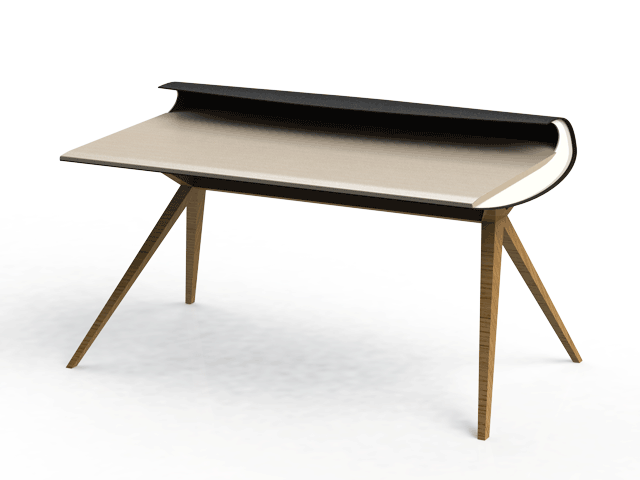
Admiring minimalist-style, yet reconciling with my former techie-self, Desk 117 was designed with "cable-caching" in mind. An embedded power strip provides electricity for devices as well as lighting while cable-managing. In addition to a large access panel in the rear, there are multiple trap doors for monitor cables, ethernet cables, speaker cables... etc etc.
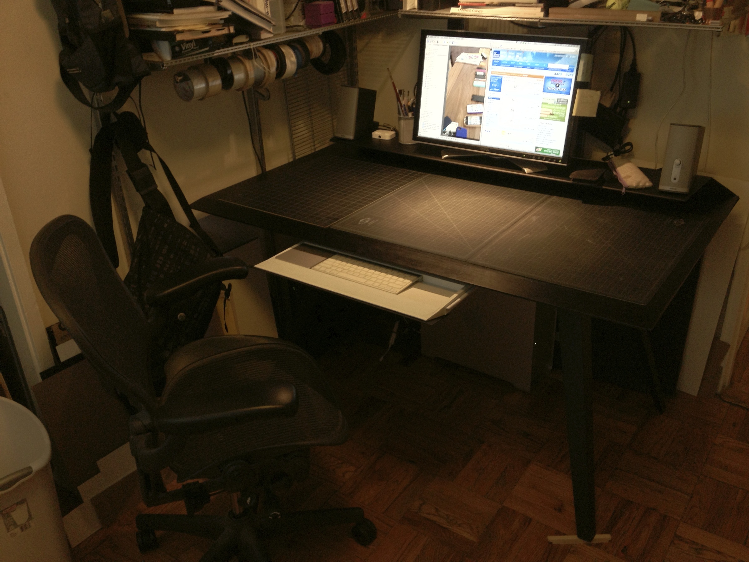
A large working surface area was deliberately specified for this desk for those of us who still use paper, (ahem! for those of us who still work with those that work with paper), or those of us who still work in the real dimension.
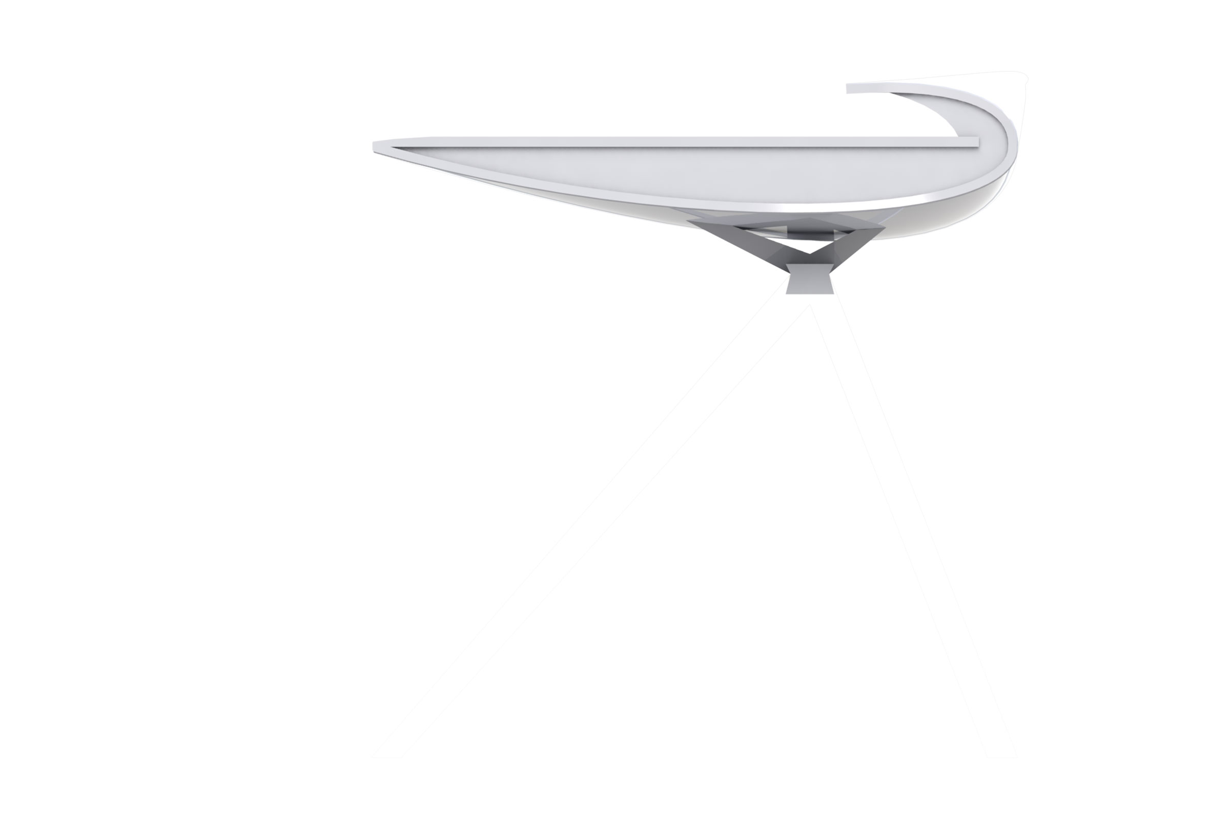
The secondary surface is deep enough to hold a 27-inch monitor/computer, not to mention stereo speakers on the side.
Part of the Model Citizens NYC exhibit during ICFF & New York Design Week, 2012!
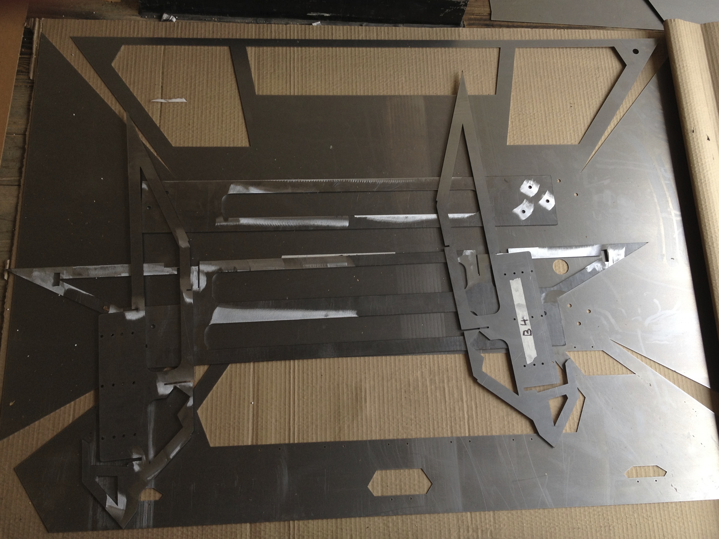
Materials: Steel, Aluminum, Wood
Approximate Dimensions: 58" L x 36" D x 38" H
Loved by: NOTCOT, Journal du Design, MocoLoco, Design Milk, Trend Hunter, Gizmodo, The Fancy, Get Addicted To... and more!
Cory's Desk
The Assignment
IND-628-01 Furniture Design
Pratt Institute, Spring 2012
Explore the discipline of furniture design through the experience of participating in a major project. Start by choosing a catagory of furniture, study the needs of the potential user and mix in inspirations of the students choosing, develop a full scale prototype.
My catagory: Work Desk
Need Statement: There is a need for a modern work desk because people don’t just work with pen and paper any more.
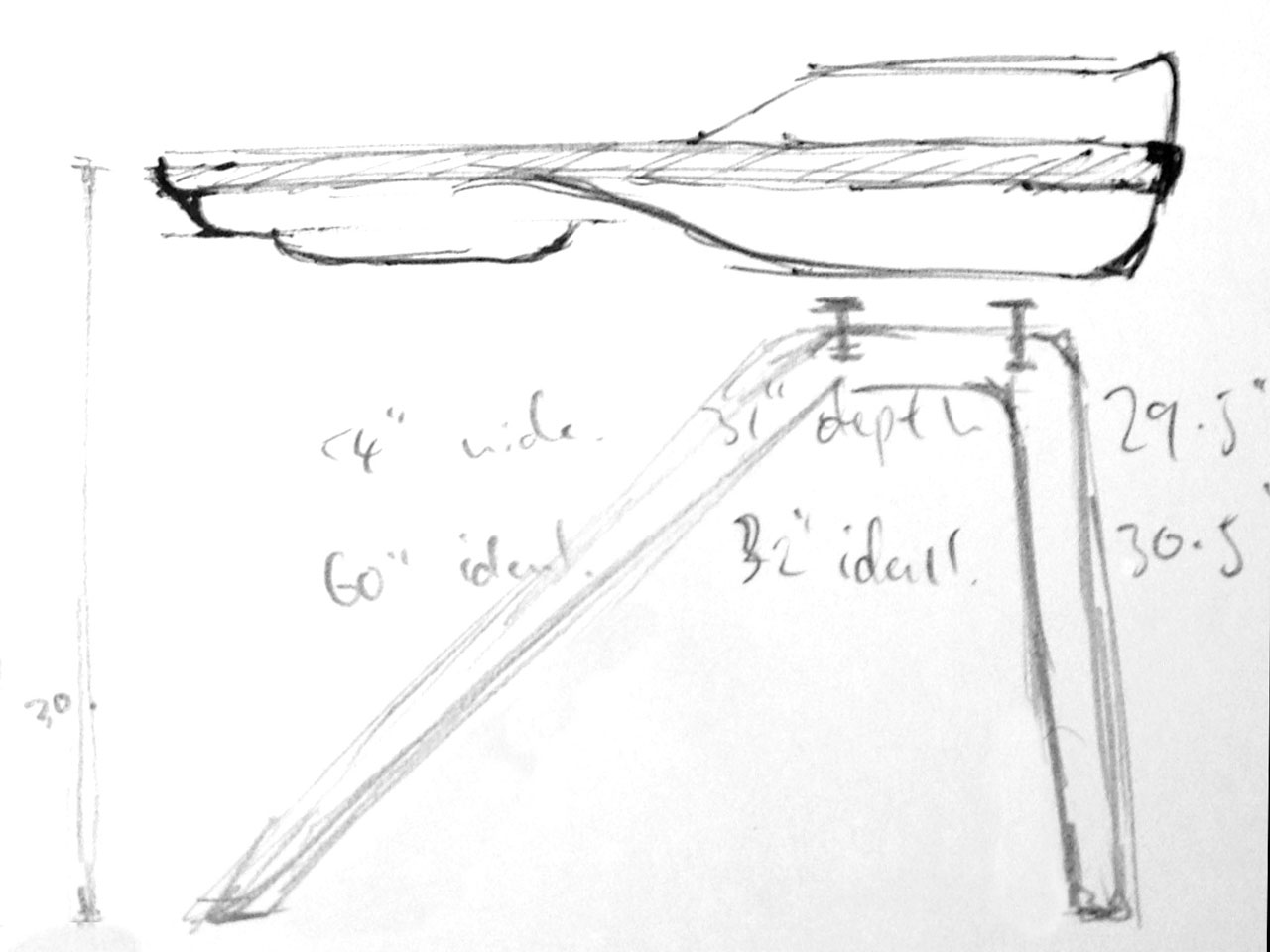
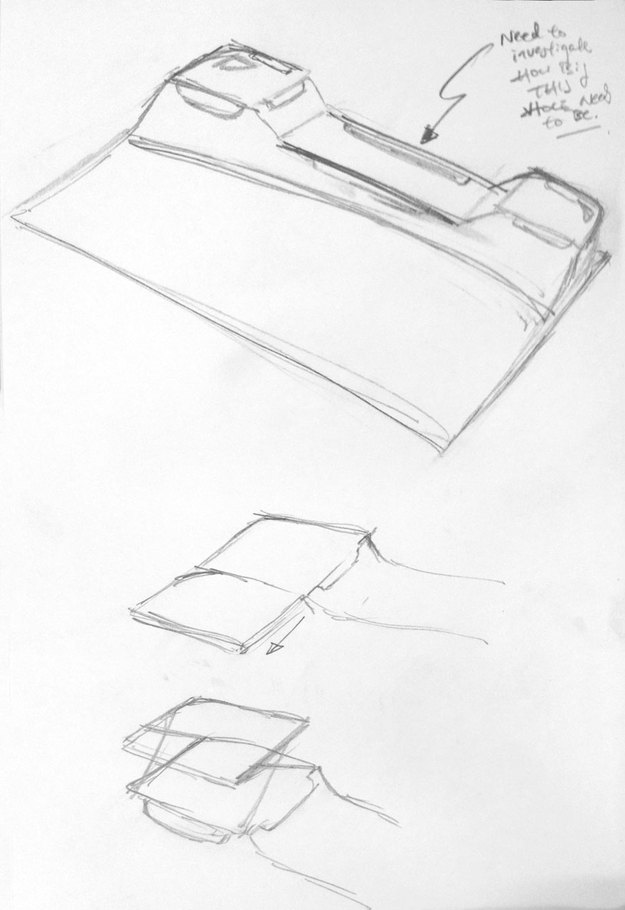
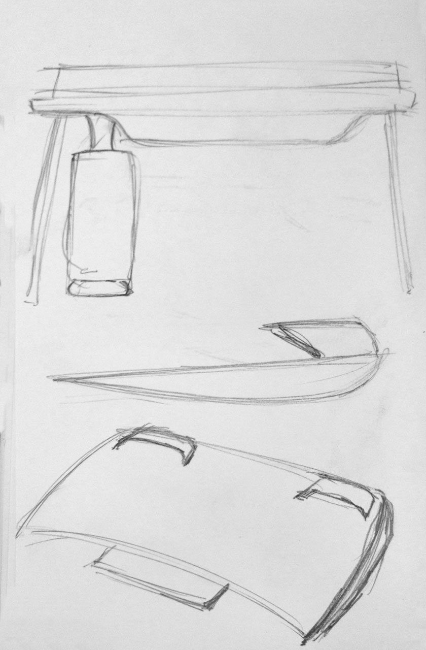
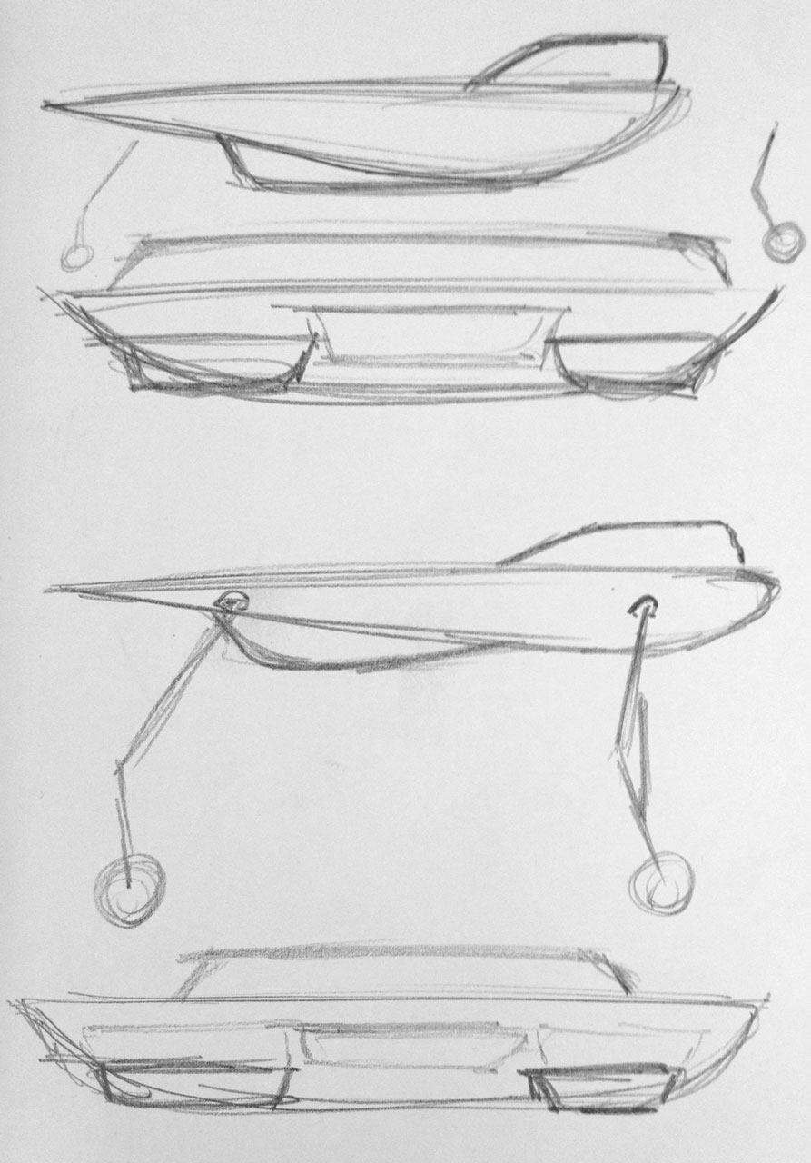
Initial Sketches
Hero Tables and Desks
Clockwise: Herman Miller Airia Desk, Herman Miller Sense Desk, Michael van der Kley - The Globus Mobile Work Station, Strand + Hvass - SH-900 Extend Table.
It was important to look around to see what was available out there. The Airia desk was by far conceptually my favorite but however while researching I found out that it was on longer in production so I could not find one to see up close and personal.
Mean while, sketching continued on 2D and 3D.
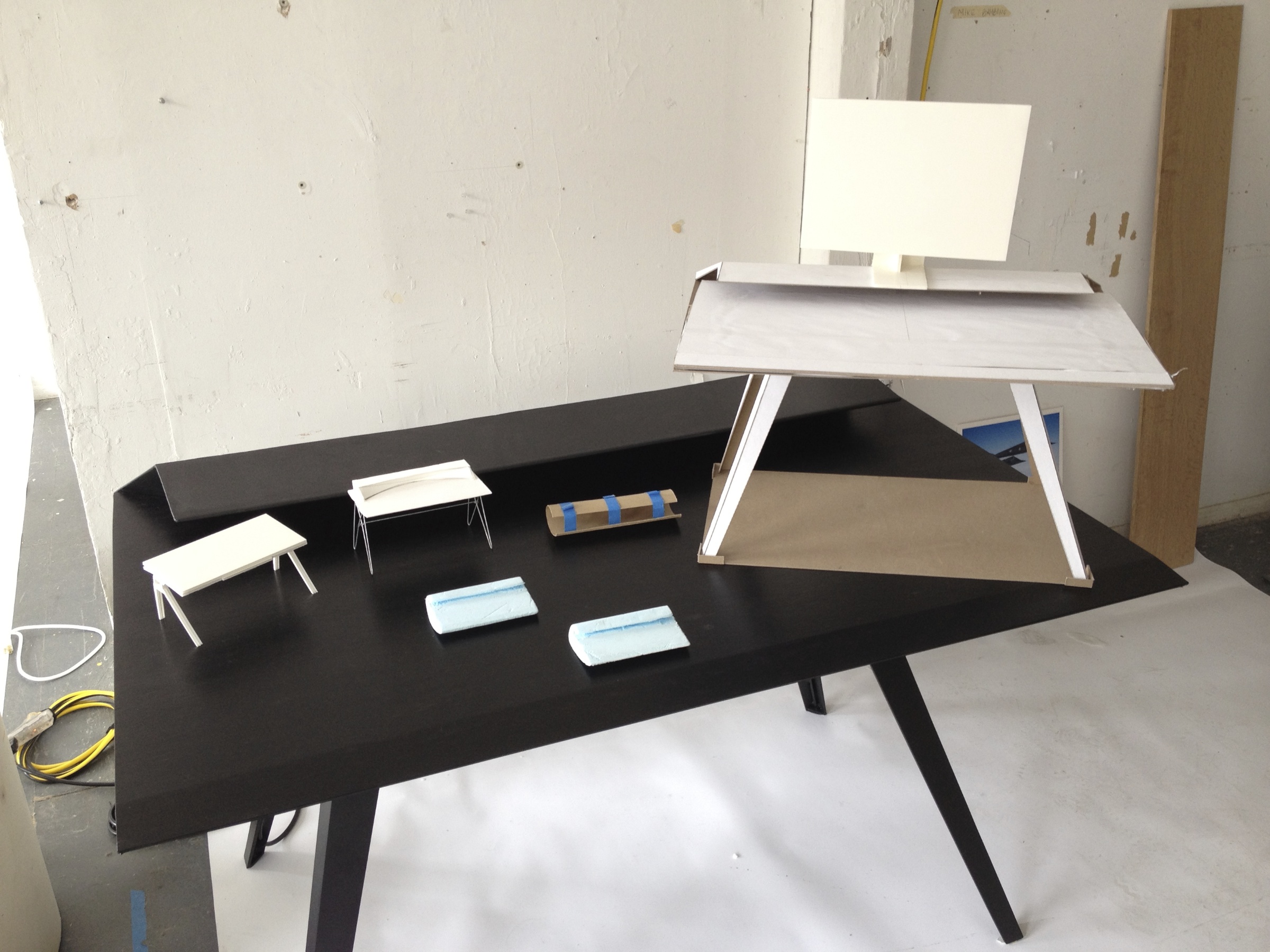
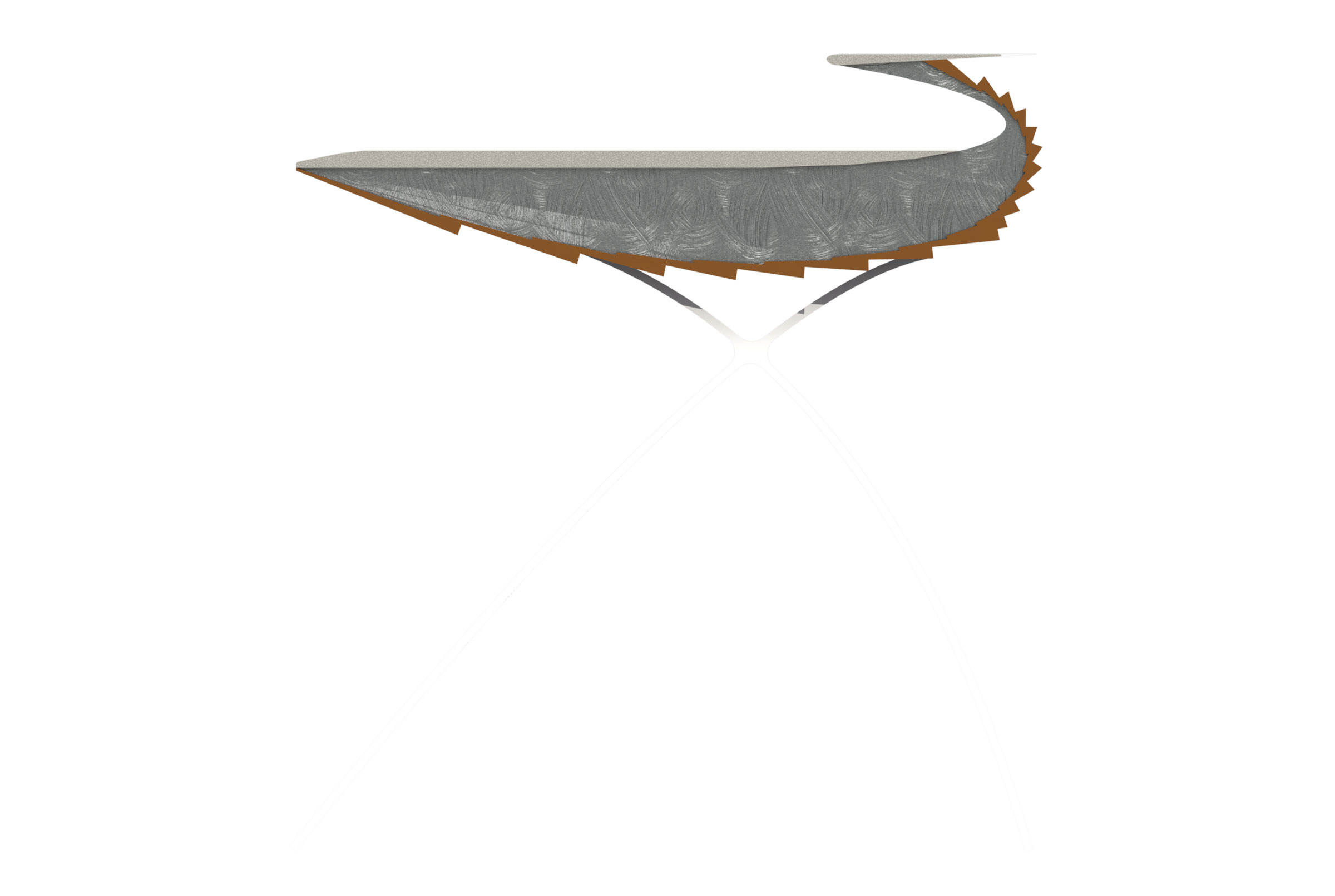
One of the small scale models was originally for a leg that could conceal any cables that would need to drop down from the table to the floor. The cross section of the leg looked like an "e" or a "c", and looked like a cross section of a wing, so I started looking at wings construction of inspiration.
Inspirational Images
model 2
the "c" shape
Hummel Ultra Cruiser wing construction, Gossamer Albatross wing construction, Averso Stella wing cross-section, Northrop XB-35 construction, Beechcraft Staggerwing wing construction and EuroFOX Aviation's Rotax 912 wing construction.
First Full Scale Model
Suggested Usage Sketch Rendering
Extended Usage
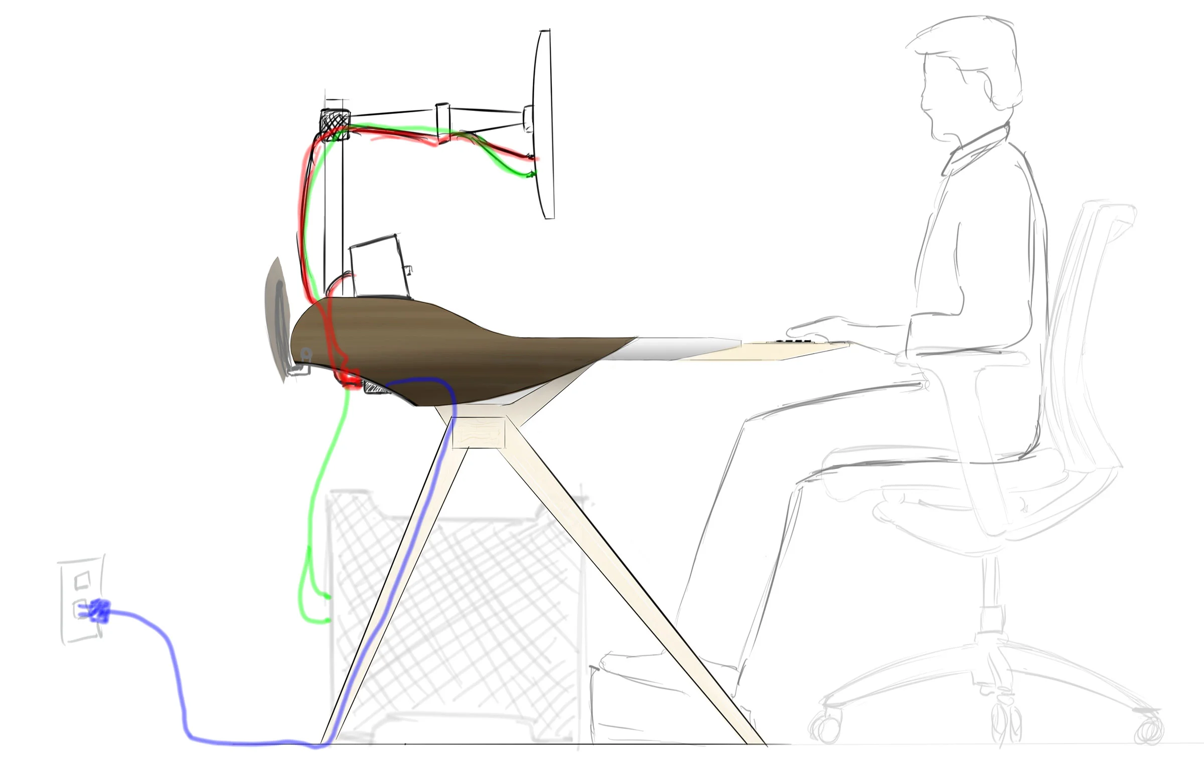
The usage of this desk needs critical consideration especially since this is a working desk, not just a place to perch. From the evolution of this drawing on the left made me realise that the positioning of the monitor may be too far away from the user when the keyboard tray is used and therefore the monitor would need to be on an arm.
Cabling is also important. Here the blue line drawers power from the wall and feeds it to a power strip in the table where it is distributed to red power cables. Green lines are for data. In the real world, my targeted user would have lots of red and green cables.
The connection between the table body, the legs, and how they connect still needs to be resolved. And it is becoming clear that some digital tools are going to be needed to take account of spatial
Solidworks modeling
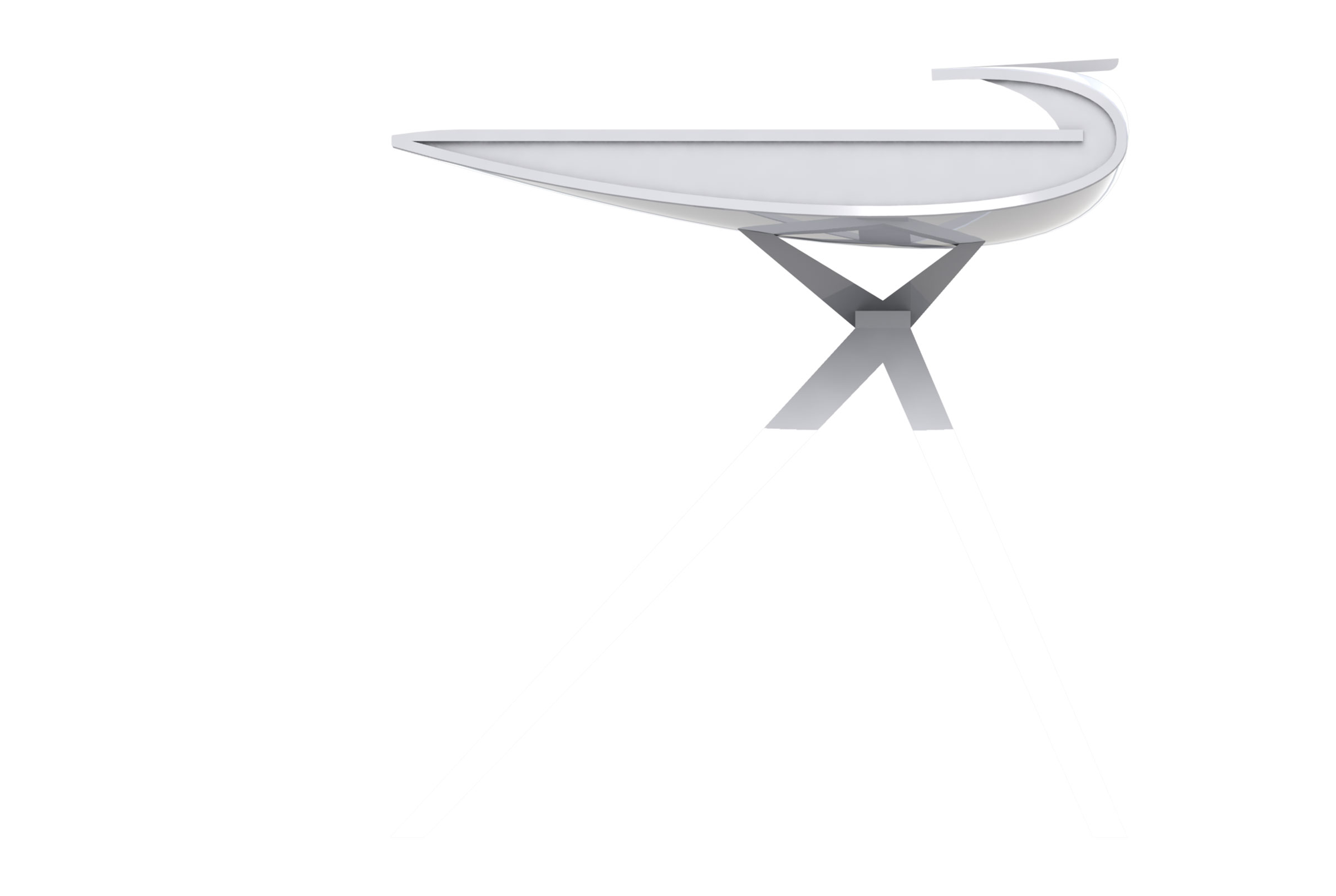
The problem I started stuggled with was with my constraint that the secondary surface must have enough space to support a 27-inch monitor. While the airfoil shape is so aesthetically pleasing it very much conflicted with the functionality I required -- a shallow curved surface is not useful for putting anything on.
... and then something really ugly happened...
Looking on the "positive" side, this latest set of renderings is like a form of abstraction. While it might be ugly, the model did push the design along because now I am looking at a different form. Tapering the sides could make it some what more bearable.
Deriving inspiration from F-117A
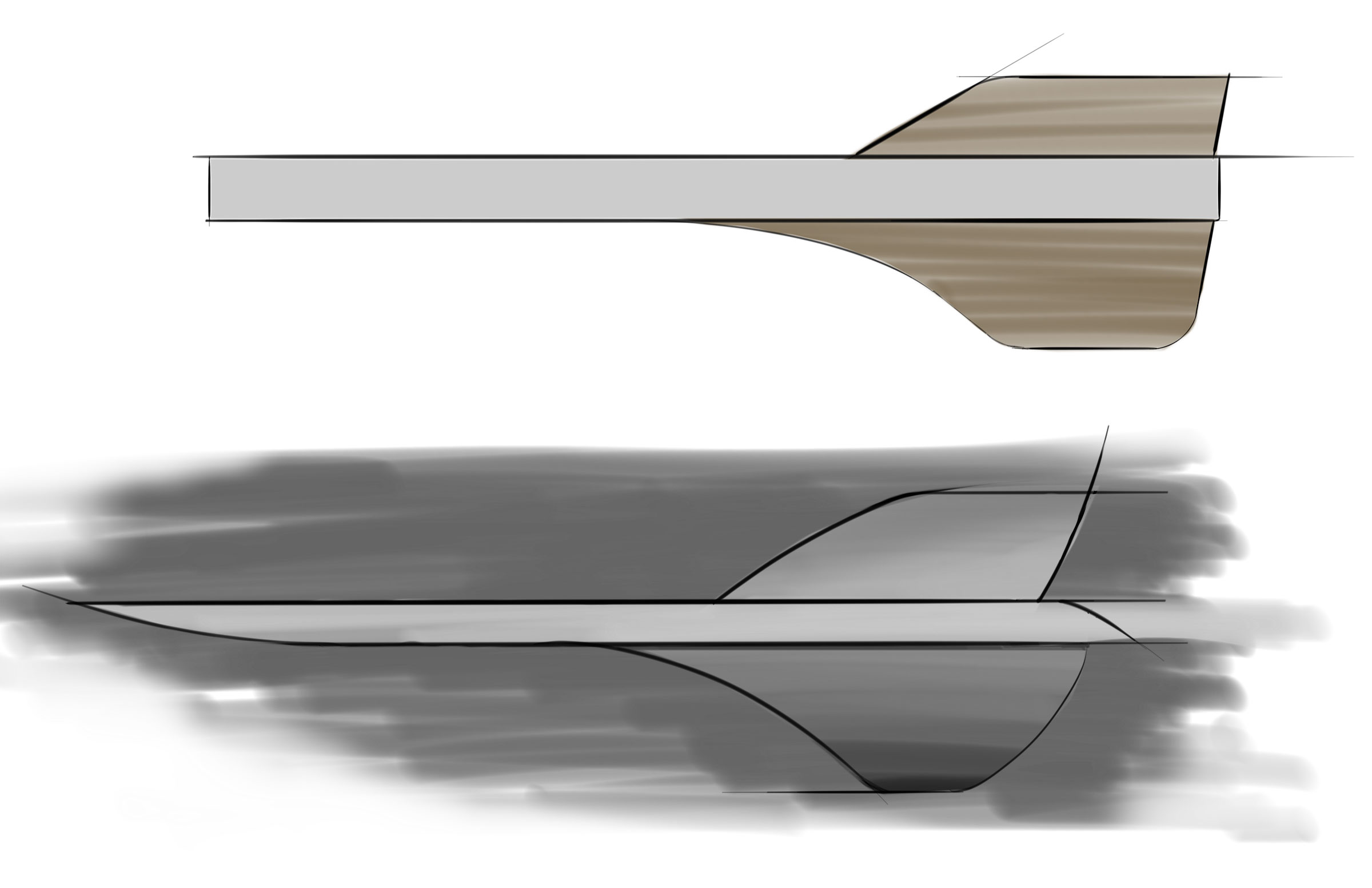
I thought this latest model looked a lot like a stealth fighter. And in stealth fighter fashion, tapered corners and off-angled panels reduced its visual signature, which gives the desk an edgy stance that seems quite pleasing to me.
http://www.edwards.af.mil/photos/mediagallery.asp?galleryID=2534
Half-Scale Model to check Proportions, complete with half scale foam core model of monitor and speakers
Full scale drawings to check for clearance
Need Statement: There is a need for a modern work desk because people don’t just work with pen and paper any more.
Why design a desk now?
There are plenty of offerings from furniture companies such as Ikea, Crate & Barrel and Room & Board. They all offer a form of nostalgic writing desk or desks of modern simplicity. A flat surface on some legs or glass with stylized saw horses, these desks promote an unrealistic minimalist style that few people can imitate or realistically maintain.
Laptops have revolutionized the way we work in recent years. We no longer have to be tied to a desk to get work done. We can sit on the couch to work. We can work at the kitchen table. We can even leave our homes or offices and work in the park or at a coffee shop. However, we still need a base to come back to; some place to charge the laptop. A place to store analog media, like paper, temporarily before they get filed or thrown away. Sometimes it maybe impractical to work anywhere else. Kitchen tables need to be reclaimed for dinner. Coffee shops lack privacy. Couches do not provide a working surface for those times cross referencing books or papers is a must.
It is wonderful to dream about the future, and we must. However, we cannot forget about the way we still work. Pen and paper are still used to communicate. For many designers it still helps us think. A truly paperless working environment requires everyone to be paperless but not everyone is ready. The wireless revolution is here but since we can’t see it, we have not noticed it is actually cluttering up the airwaves. In a typical Manhattan apartment building where everyone hosts their own wireless networks, signals interfere with one another, which means slow data speeds that are not suitable for media centric applications. Traditional cabled network maybe a solution for some.
What's different?
The problem with old desks is that there are little or no considerations for cables that are required to provide data and power to our electronics. Some tables have holes drilled through the surface in the corner or towards the back of the desk but no hole is ever big enough or the plastic grommet provided gets in the way. More modern tables are obsessed in providing “the clean look” that there is no room to facilitate with cable management. Sometimes keyboard trays are too low and obstruct users legs. Some desks provide cable organizing trays under the work surface but severely underestimate the size of users’ hands thus making organization difficult. There should be generous space provided for “cable-caching” and plenty of outlets power or data.
There are many cable organization accessories on the market; everything from wiring trays to wiring raceways; cable turtles to cable zippers. Unfortunately many of these objects promote wear and tear on cables if they are wound too tightly or have too many sharp bends. Other devices make a bundle of cables even bigger than they originally started with. The most popular and useful device is one-wrap velcro so there should be no gimmicks.
Minimalist desks seldom provide space for storage for office supplies, therefore sometimes users leave them on the desktop thus contributing to clutter or reduced desktop space. A desk should still provide some storage.
